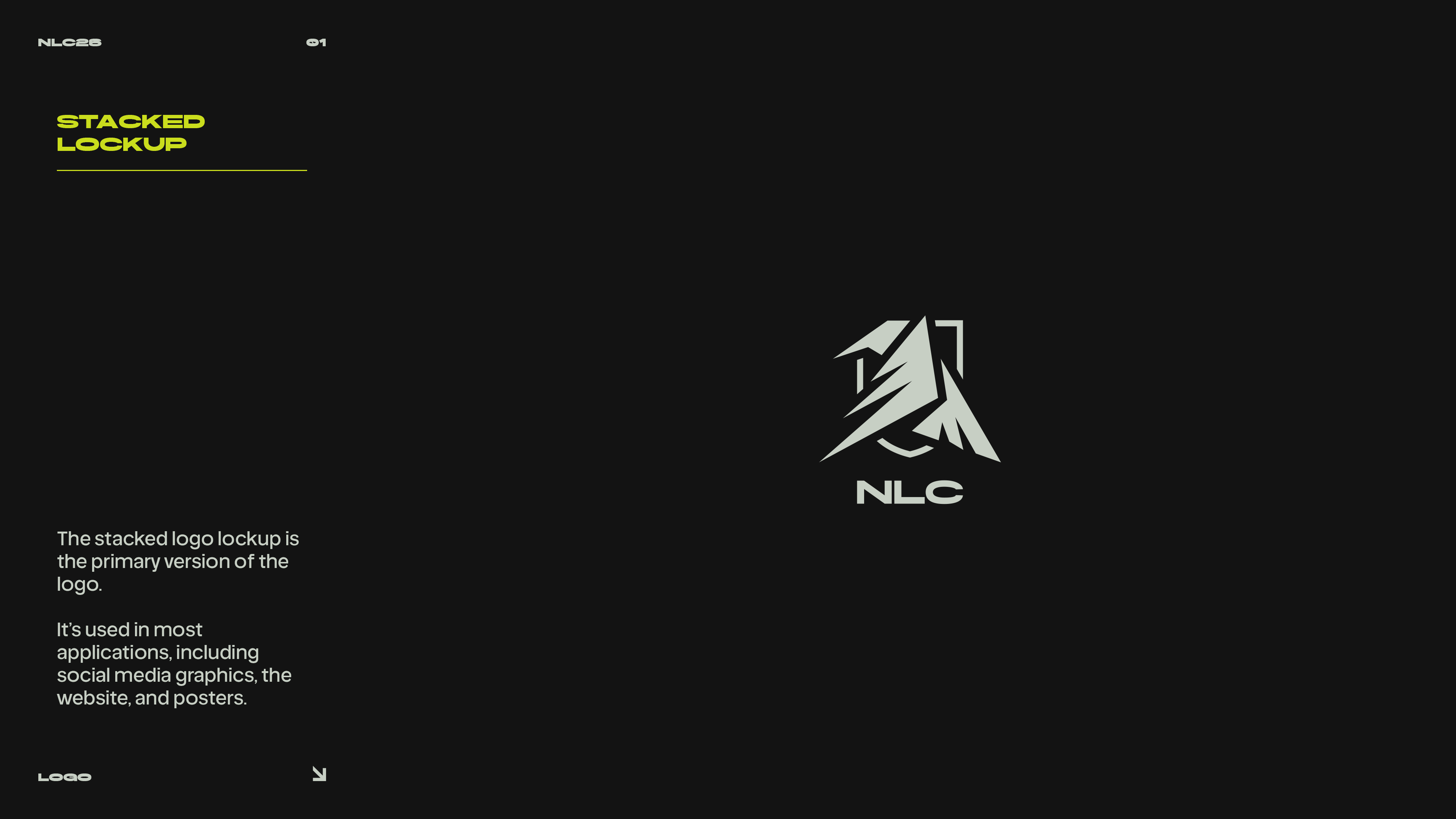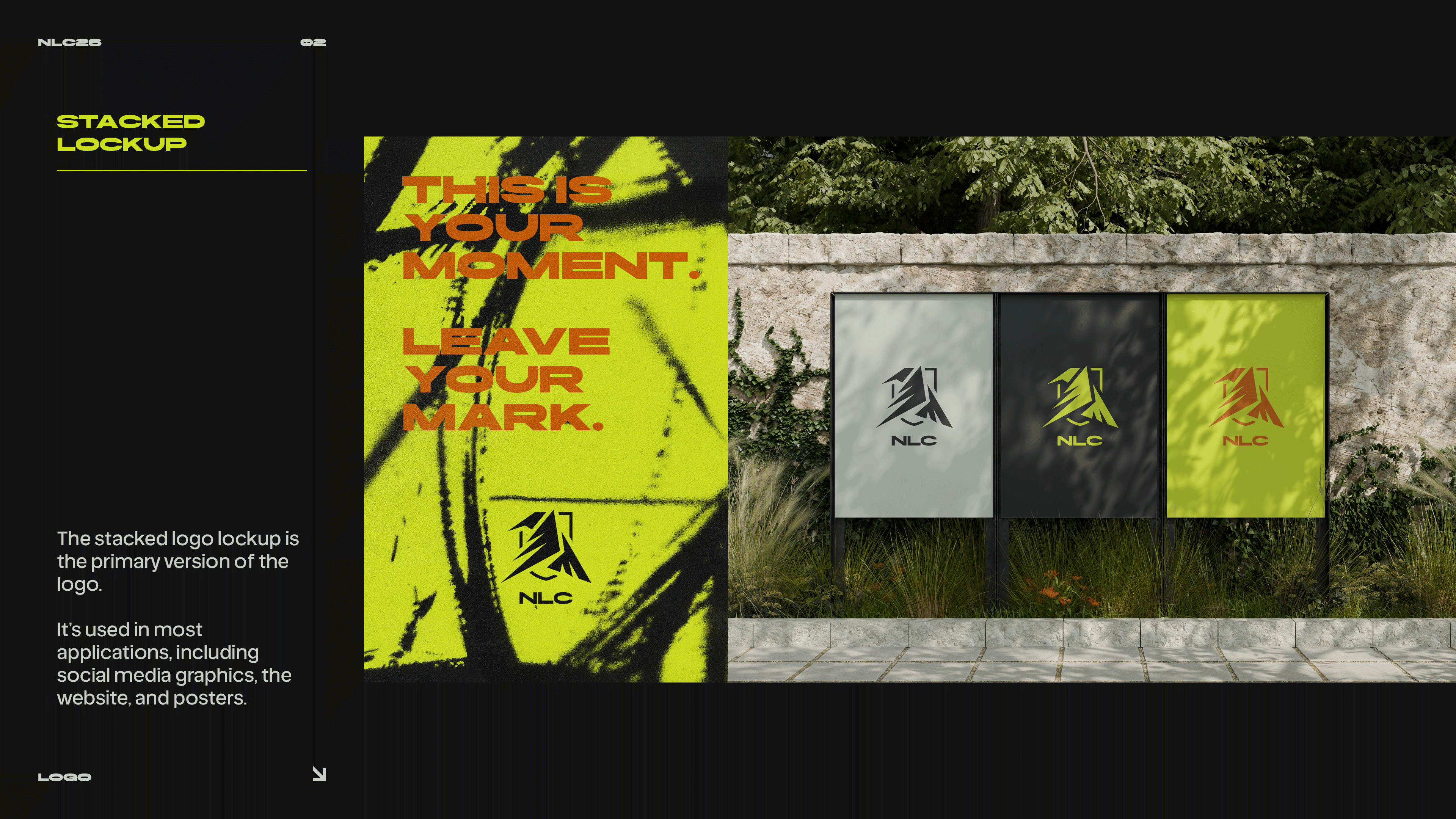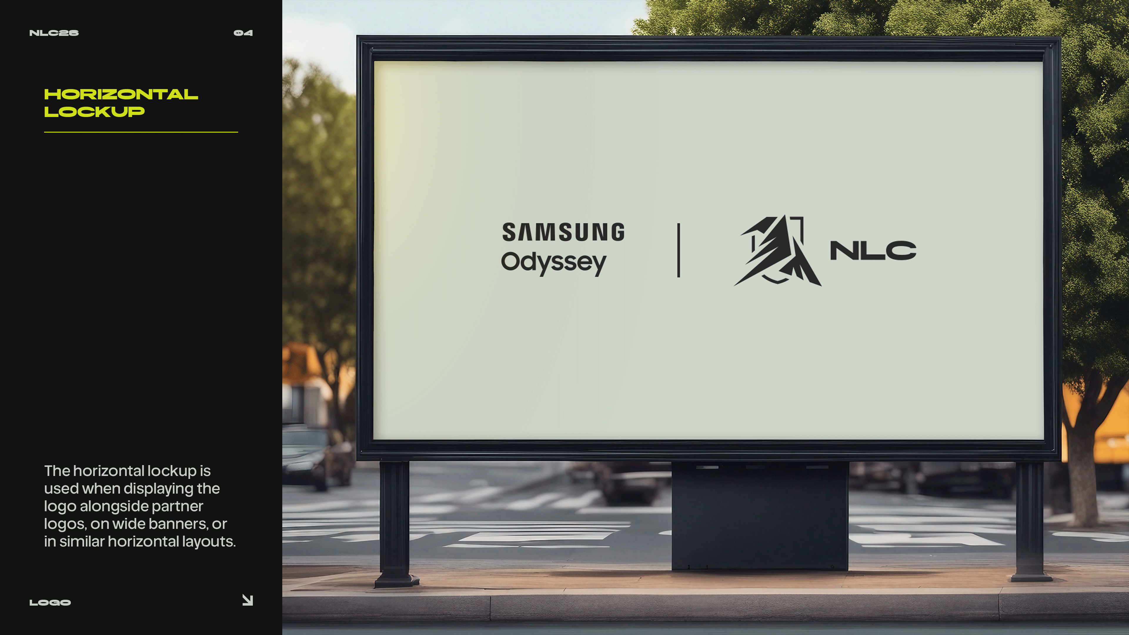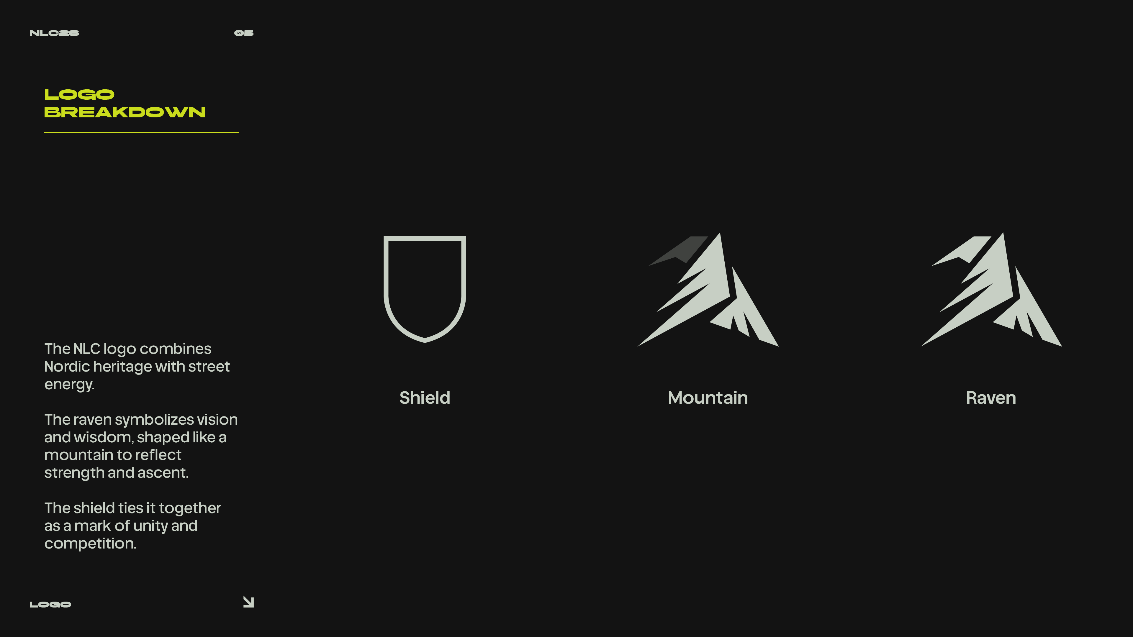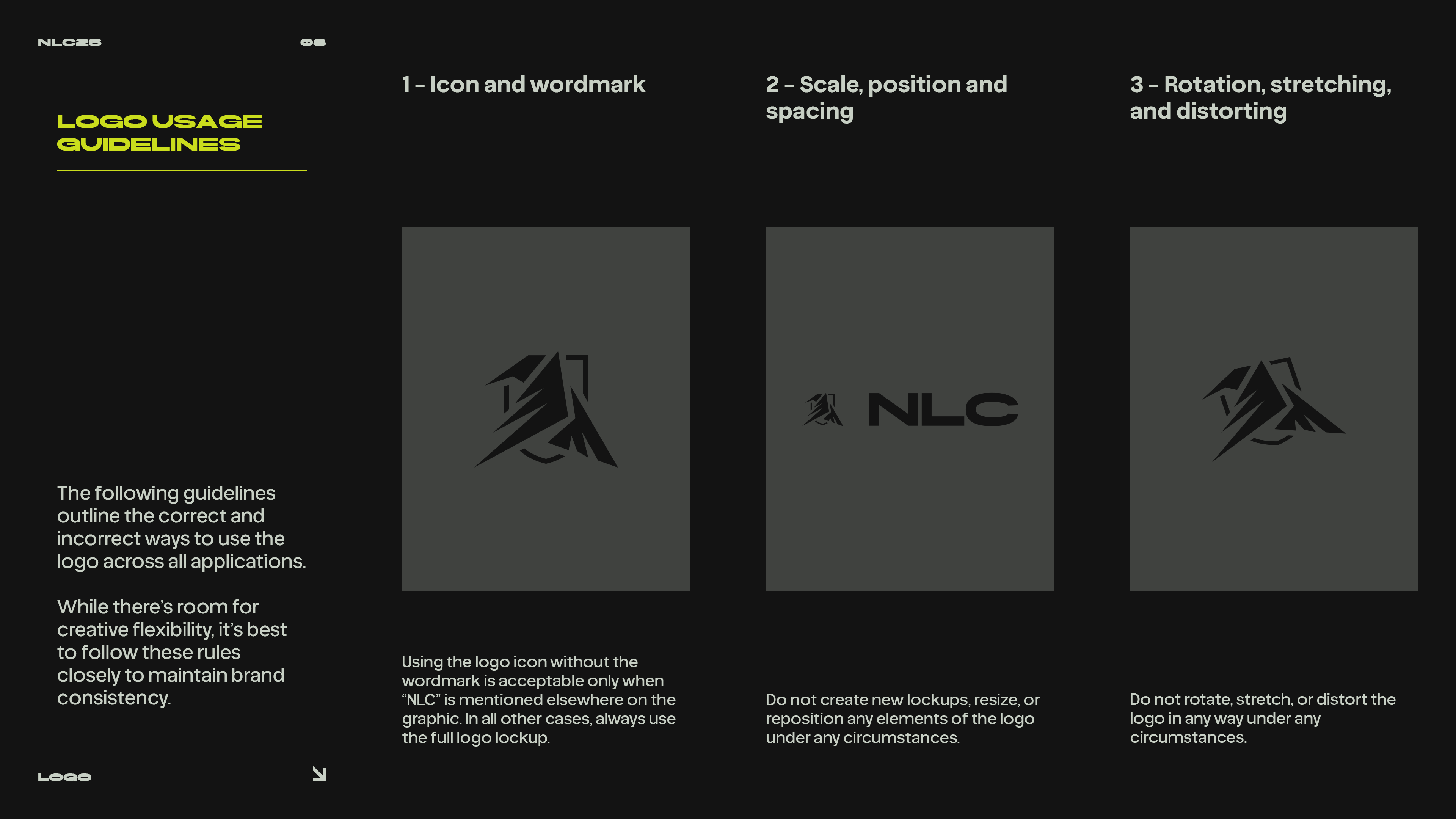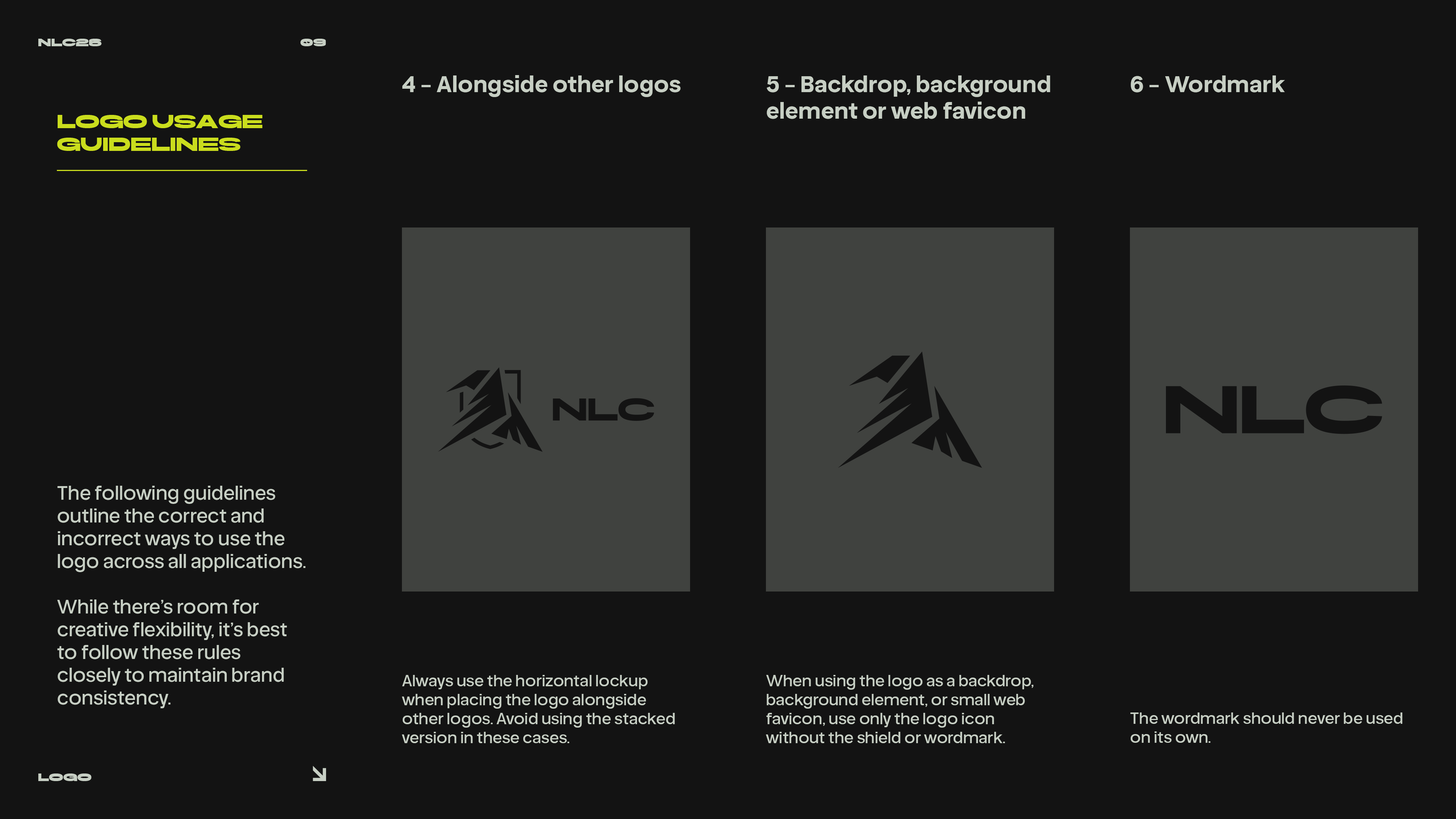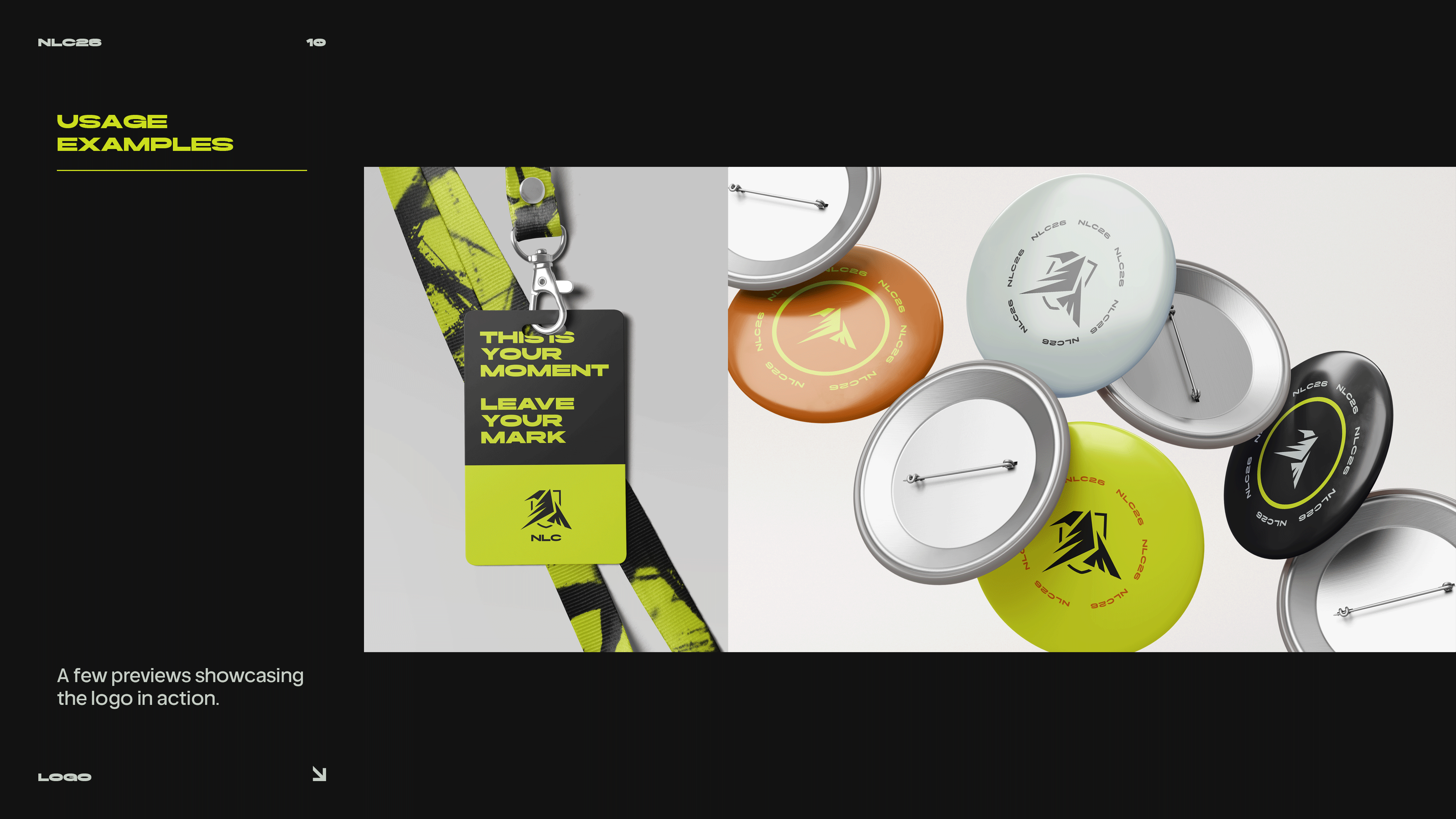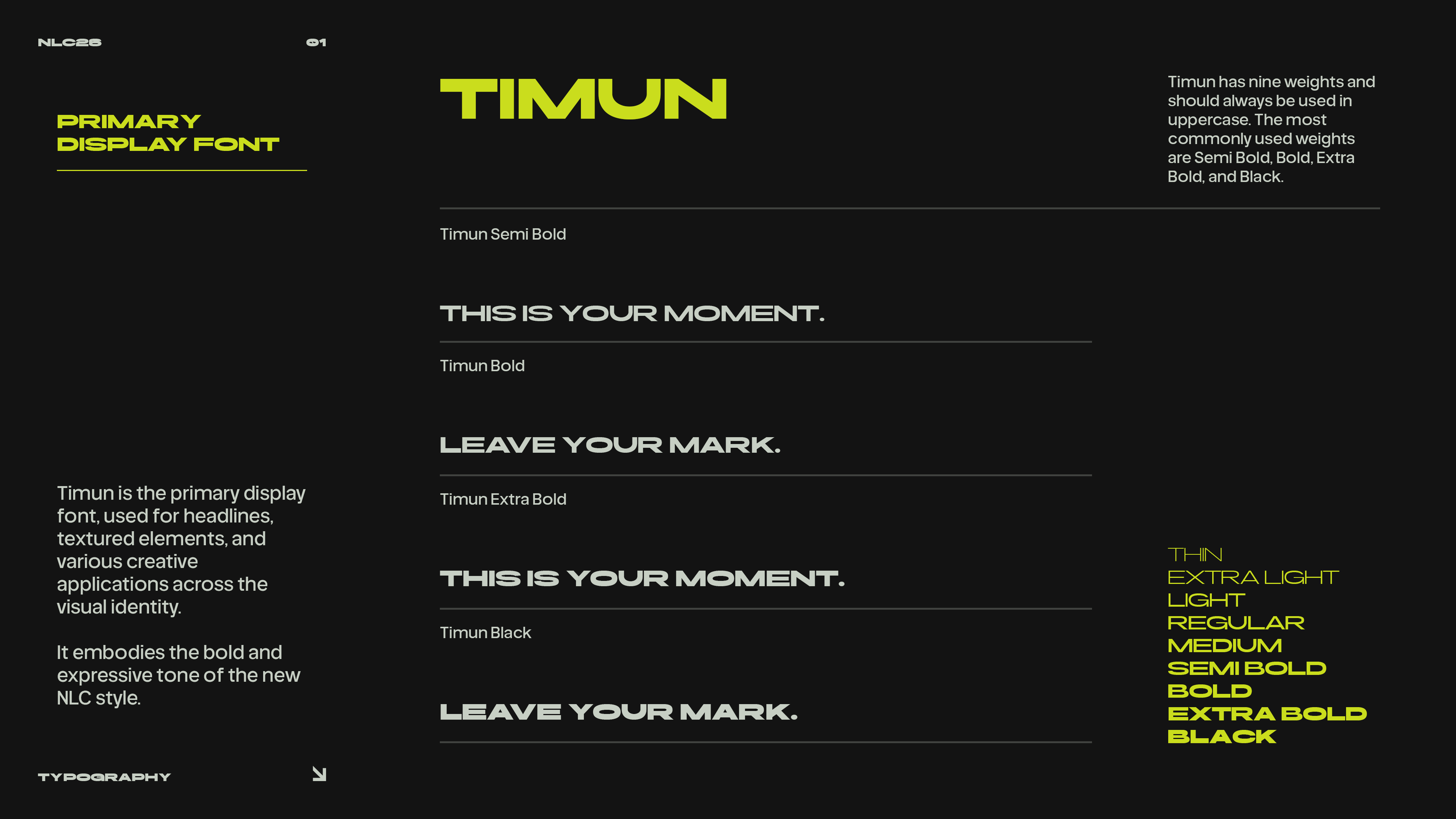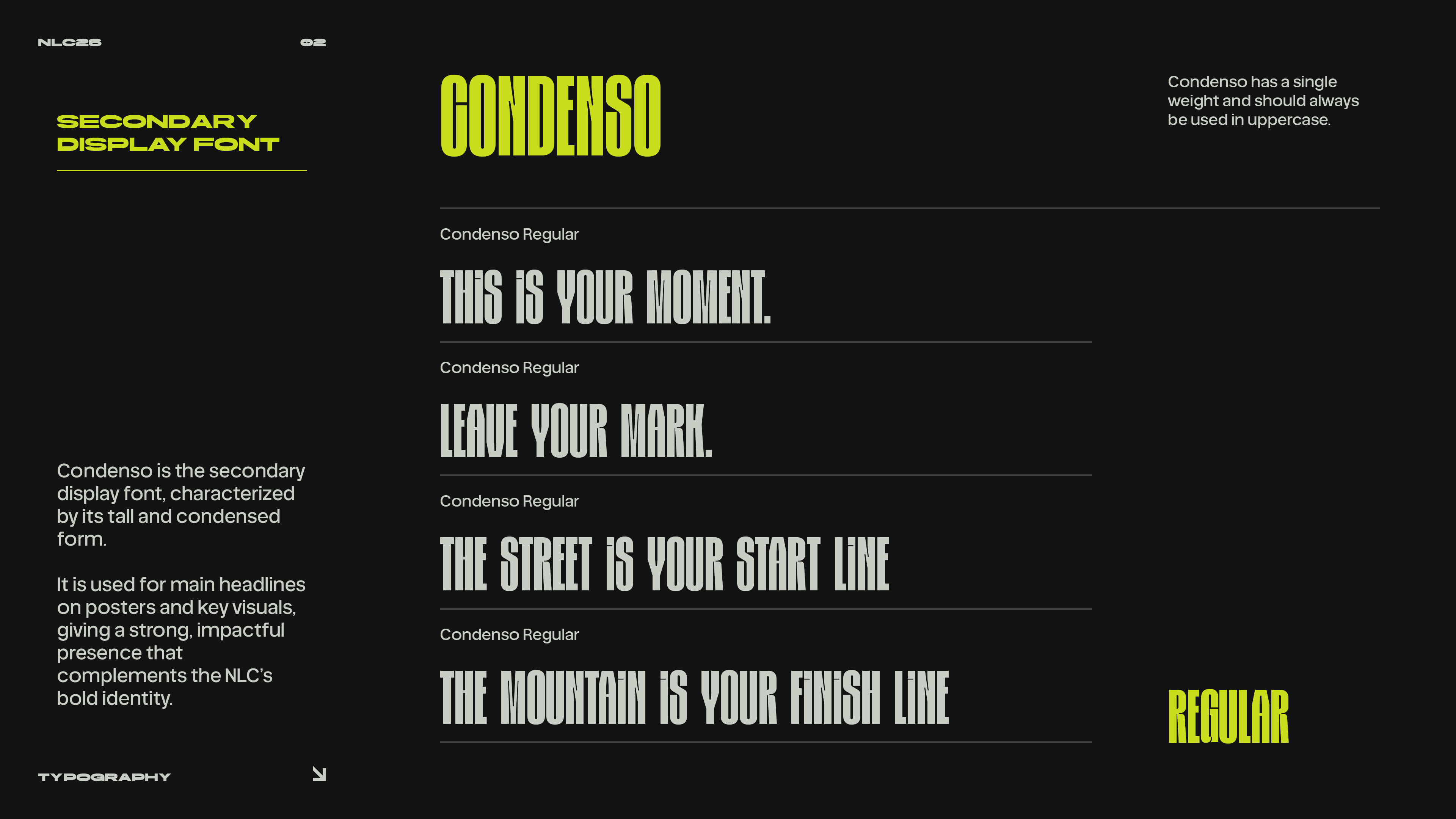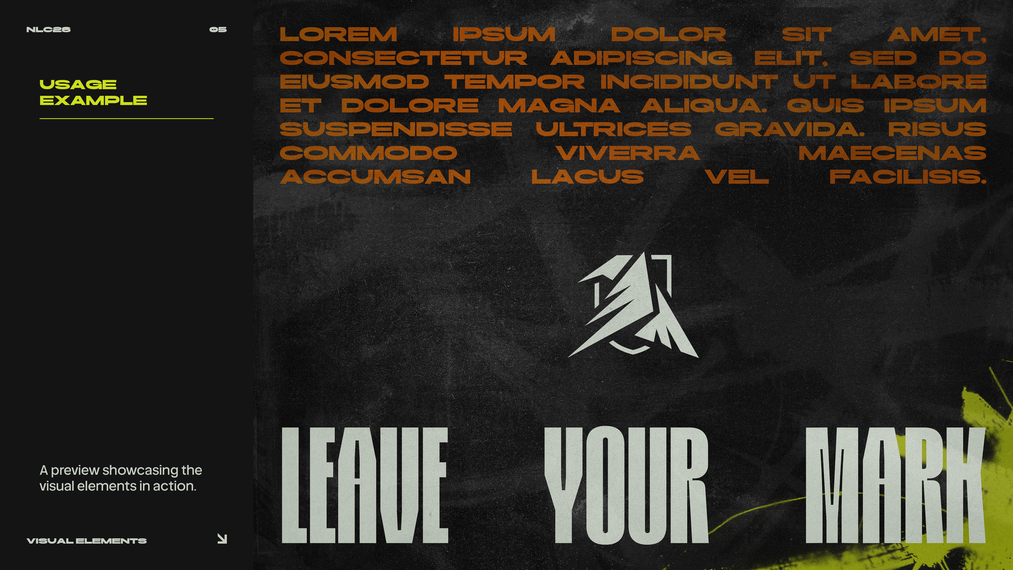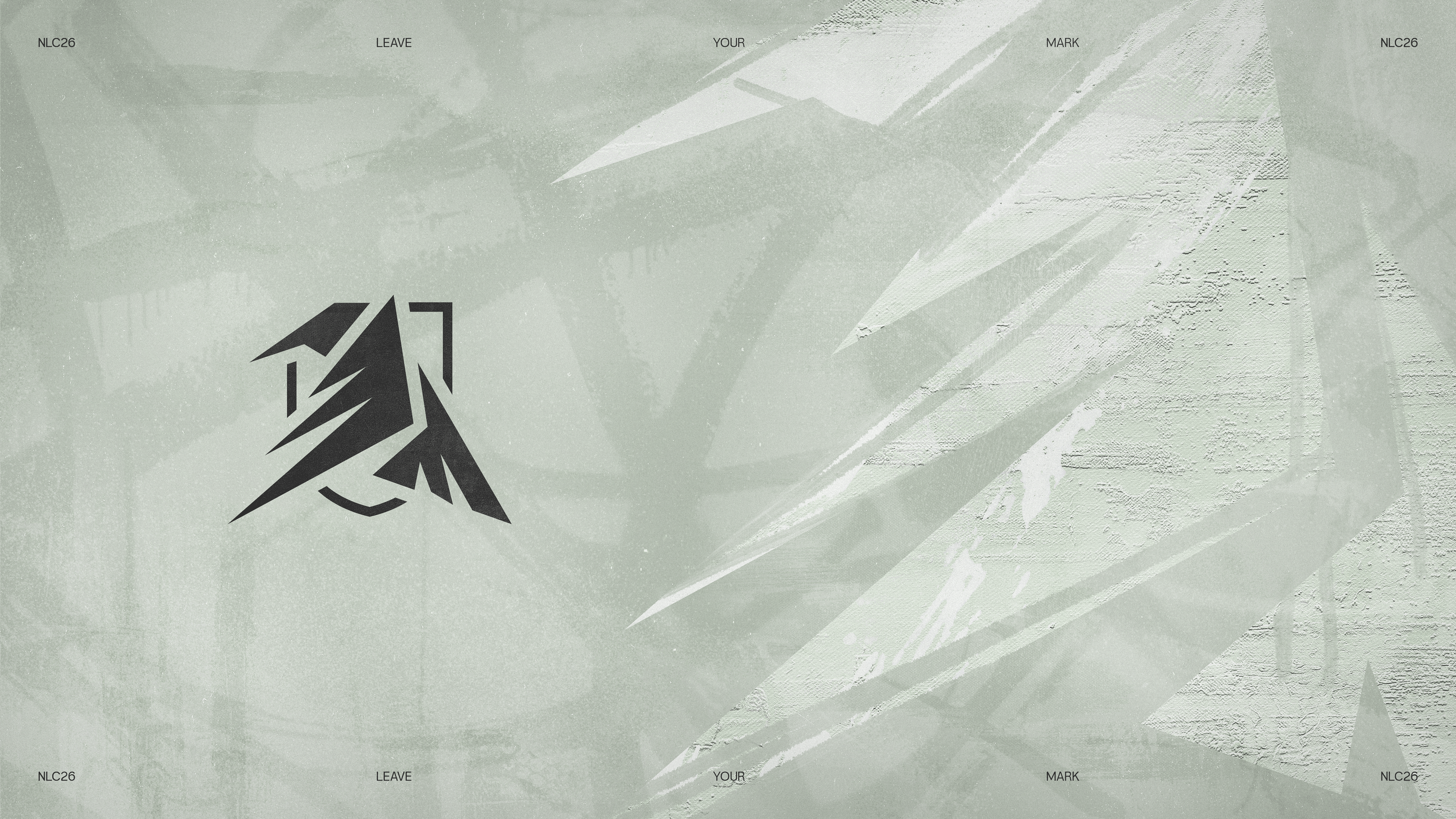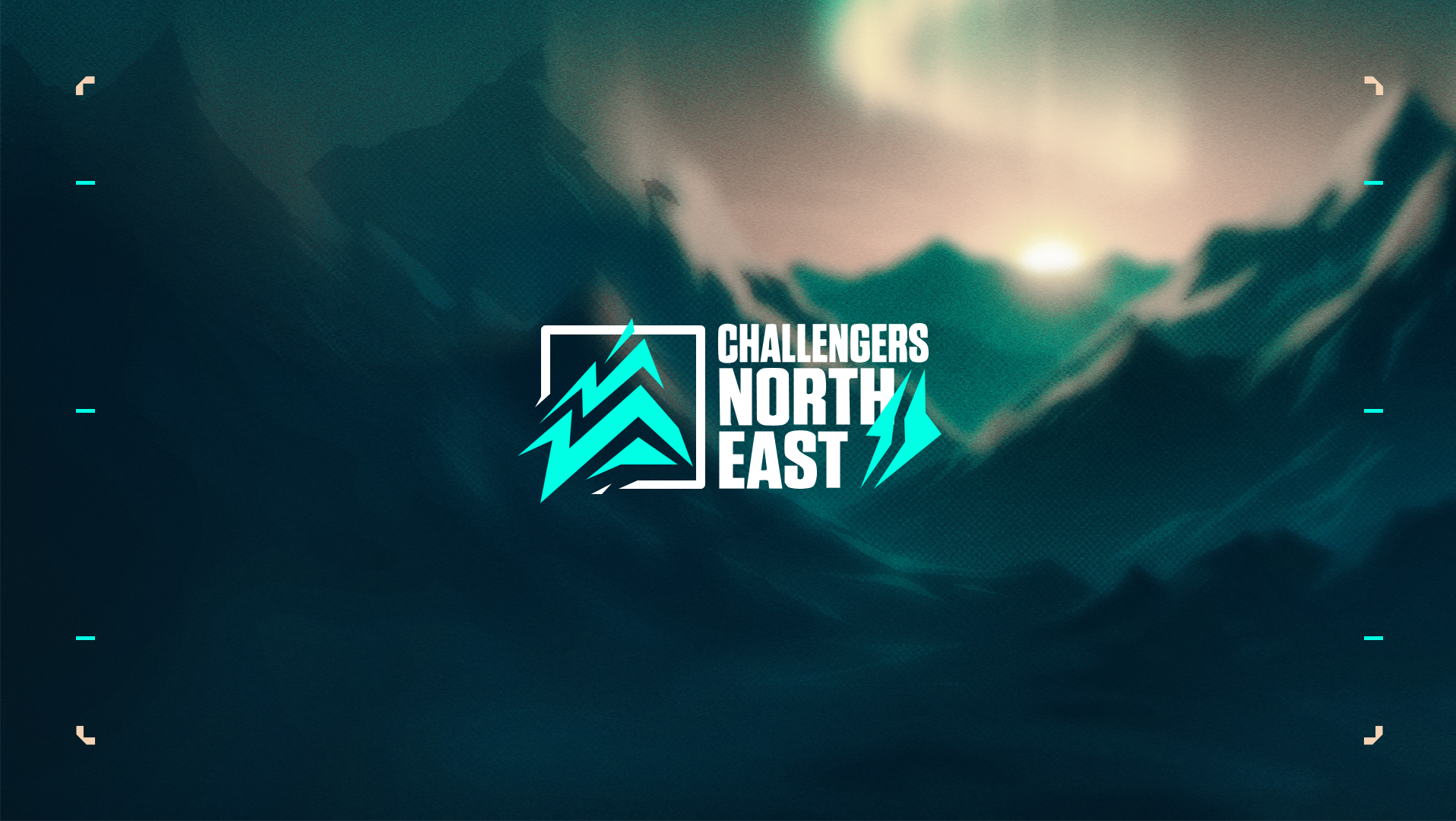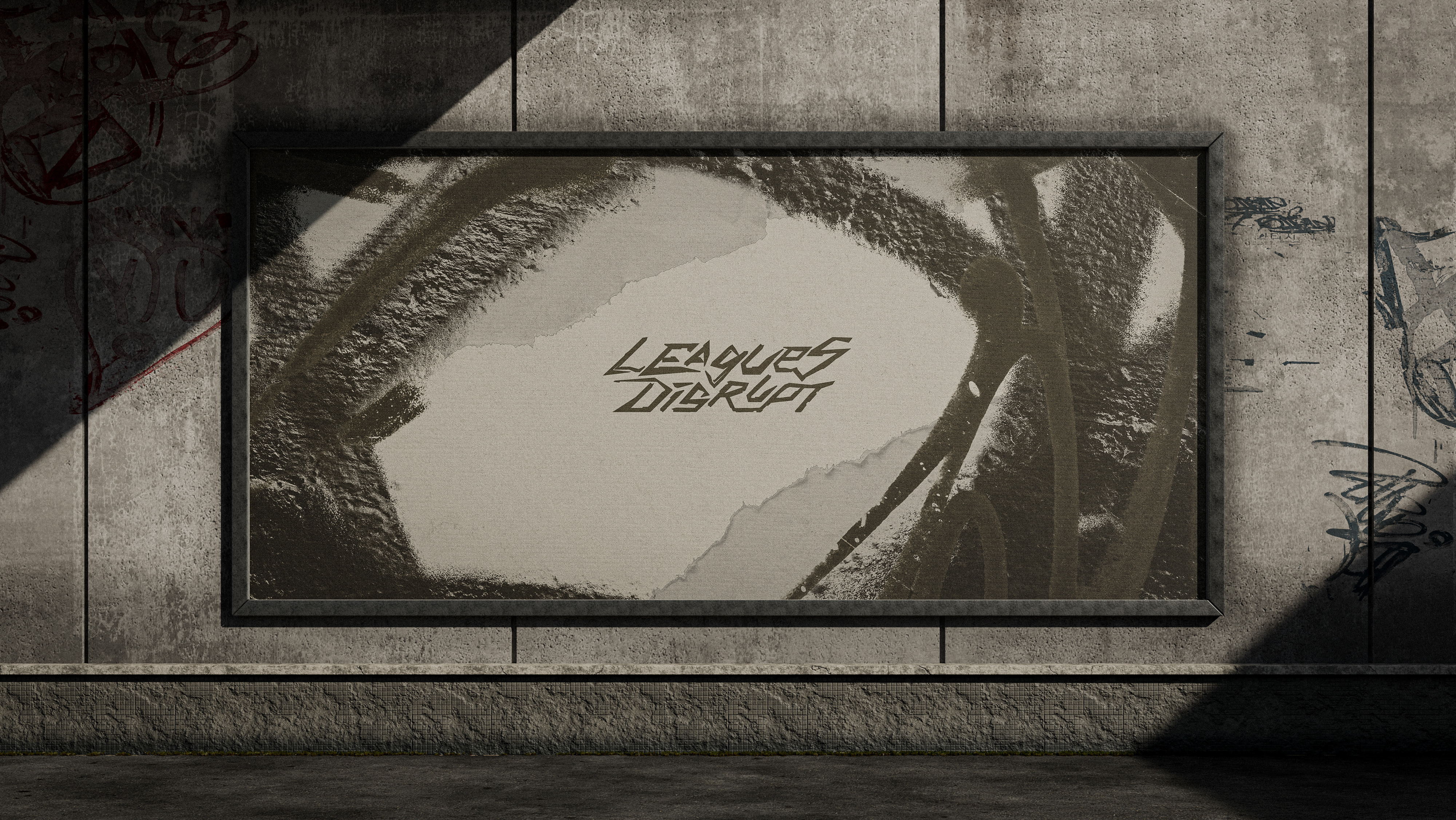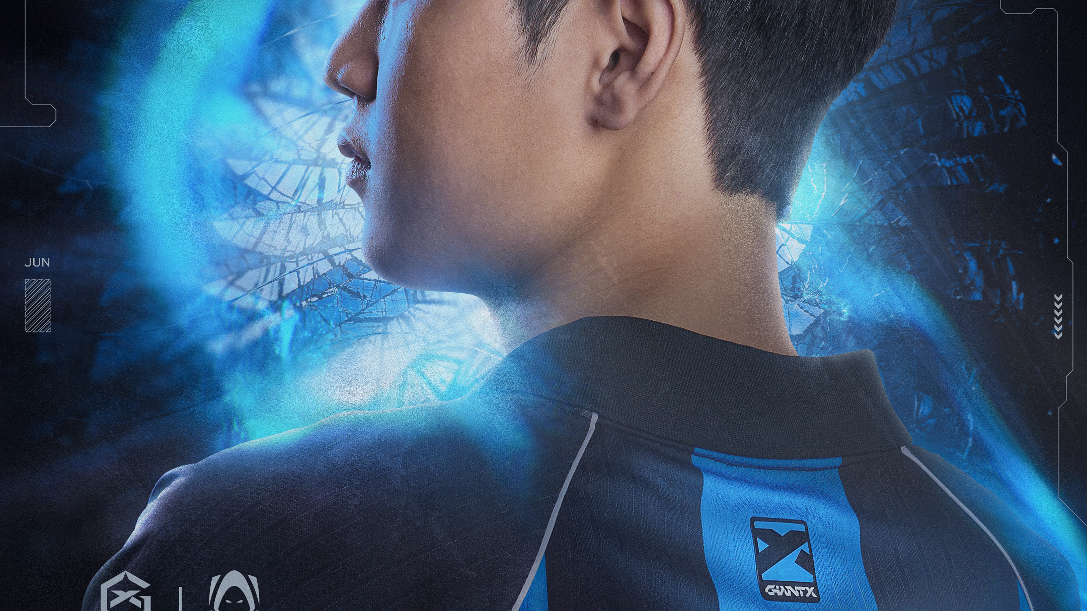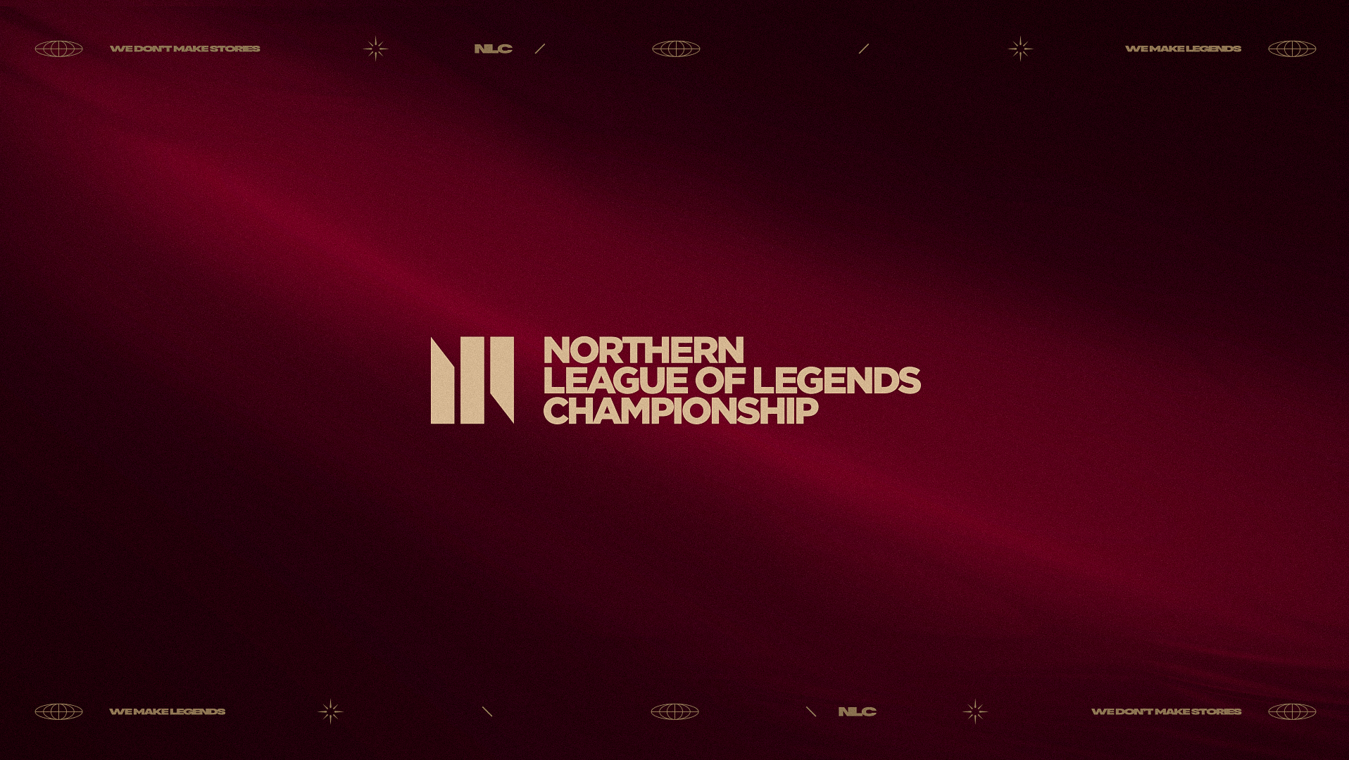
NLC26 marks a bold evolution of the league’s identity, introducing a new direction inspired by urban street culture, northern landscapes, and Norse symbolism. The new logo represents a raven, a symbol of pride and power, shaped with sharp, angular forms that subtly echo a mountain, while the shield structure reinforces competitiveness.
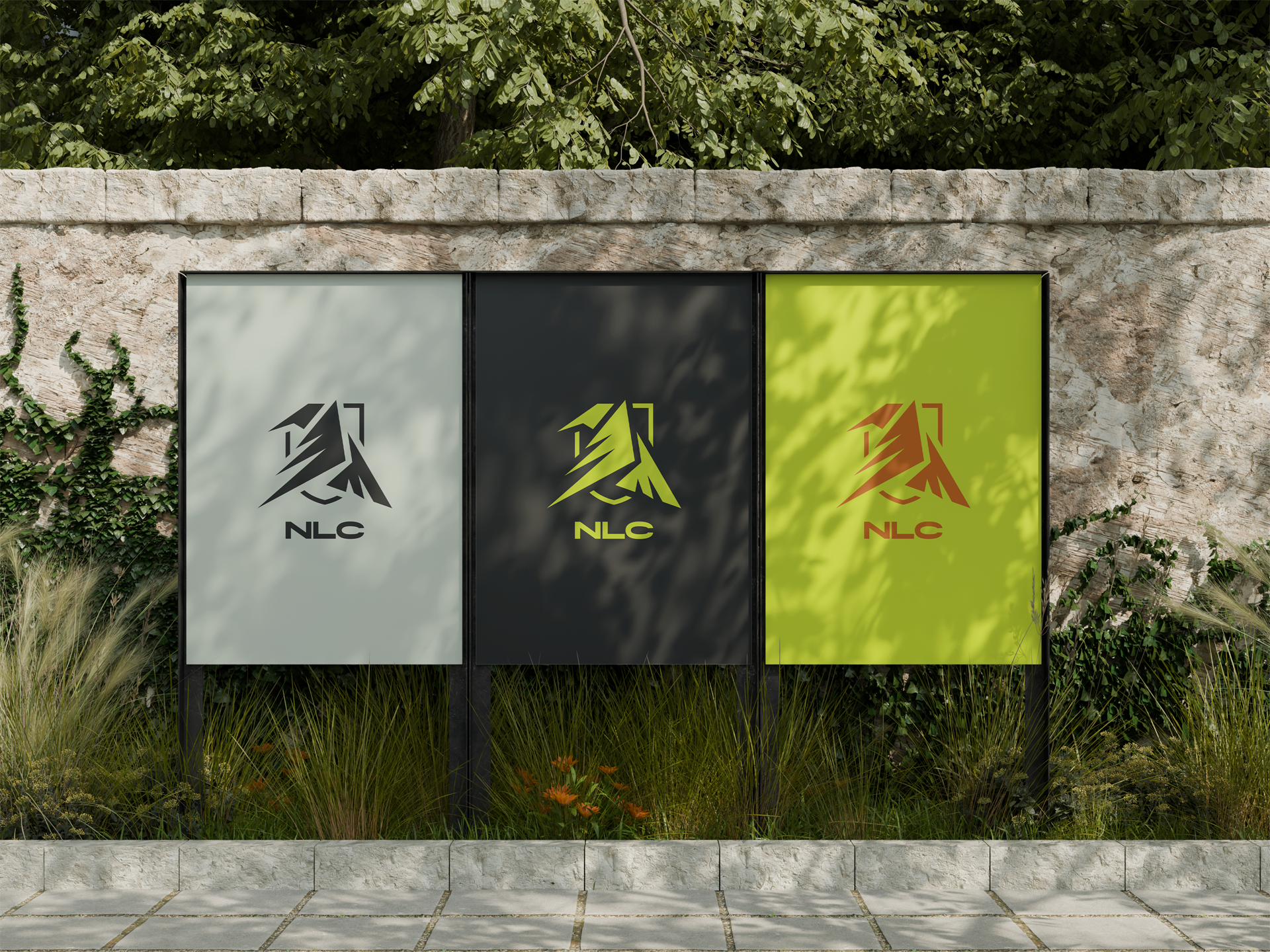
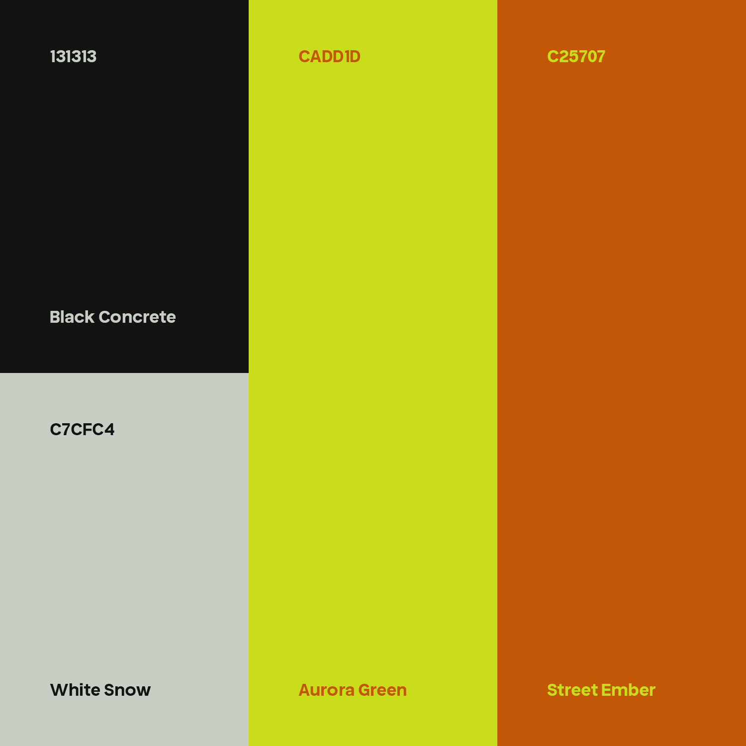
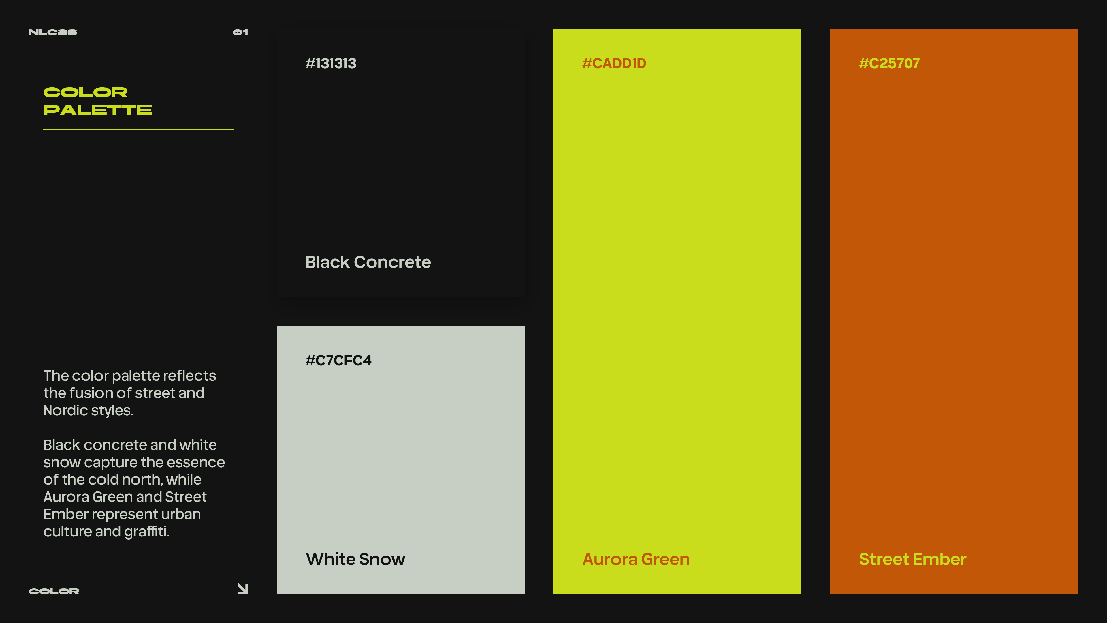
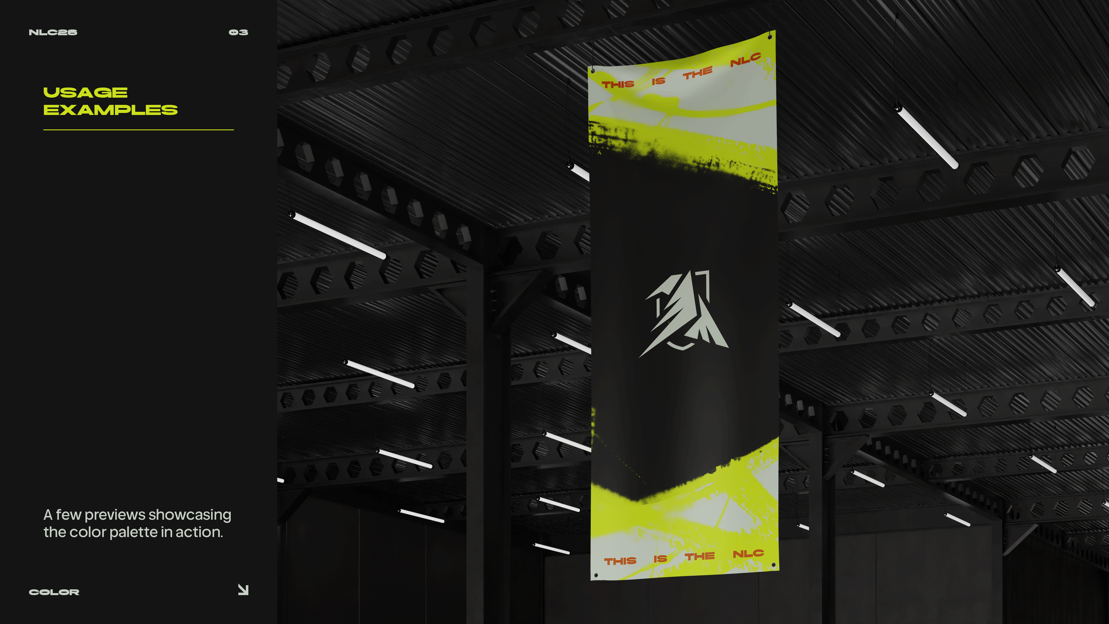
The concept bridges both worlds: ravens as a familiar presence in urban environments and a strong reference to Norse mythology. The color palette supports this narrative, combining Aurora Green, Street Ember Orange, Black Concrete, and White Snow to create a system that feels vibrant, gritty, and clean at the same time.
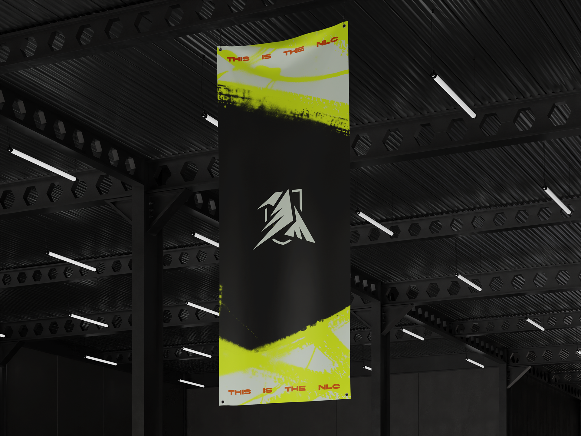
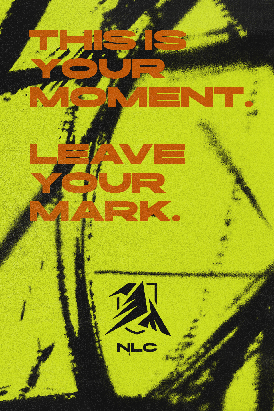
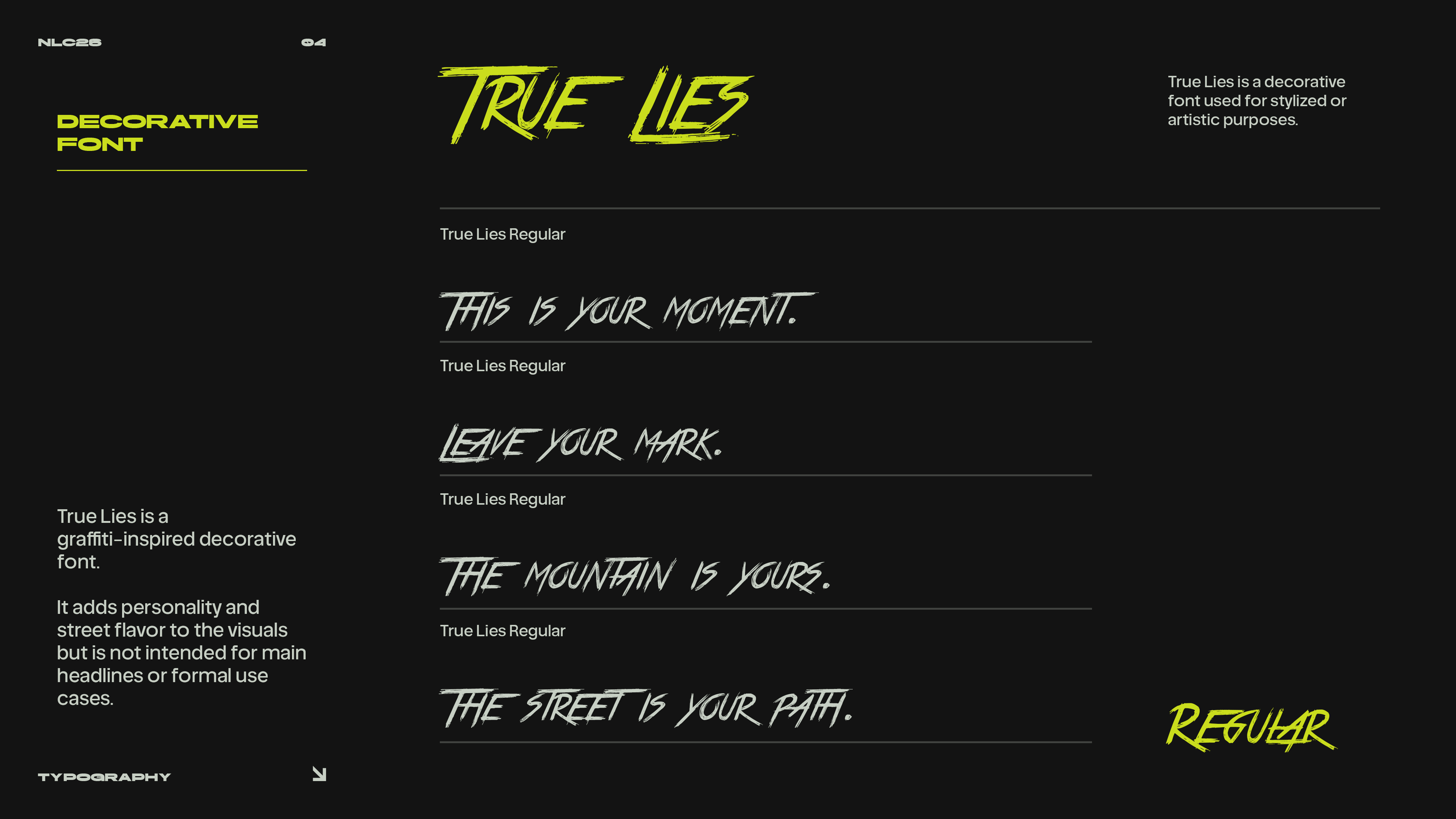
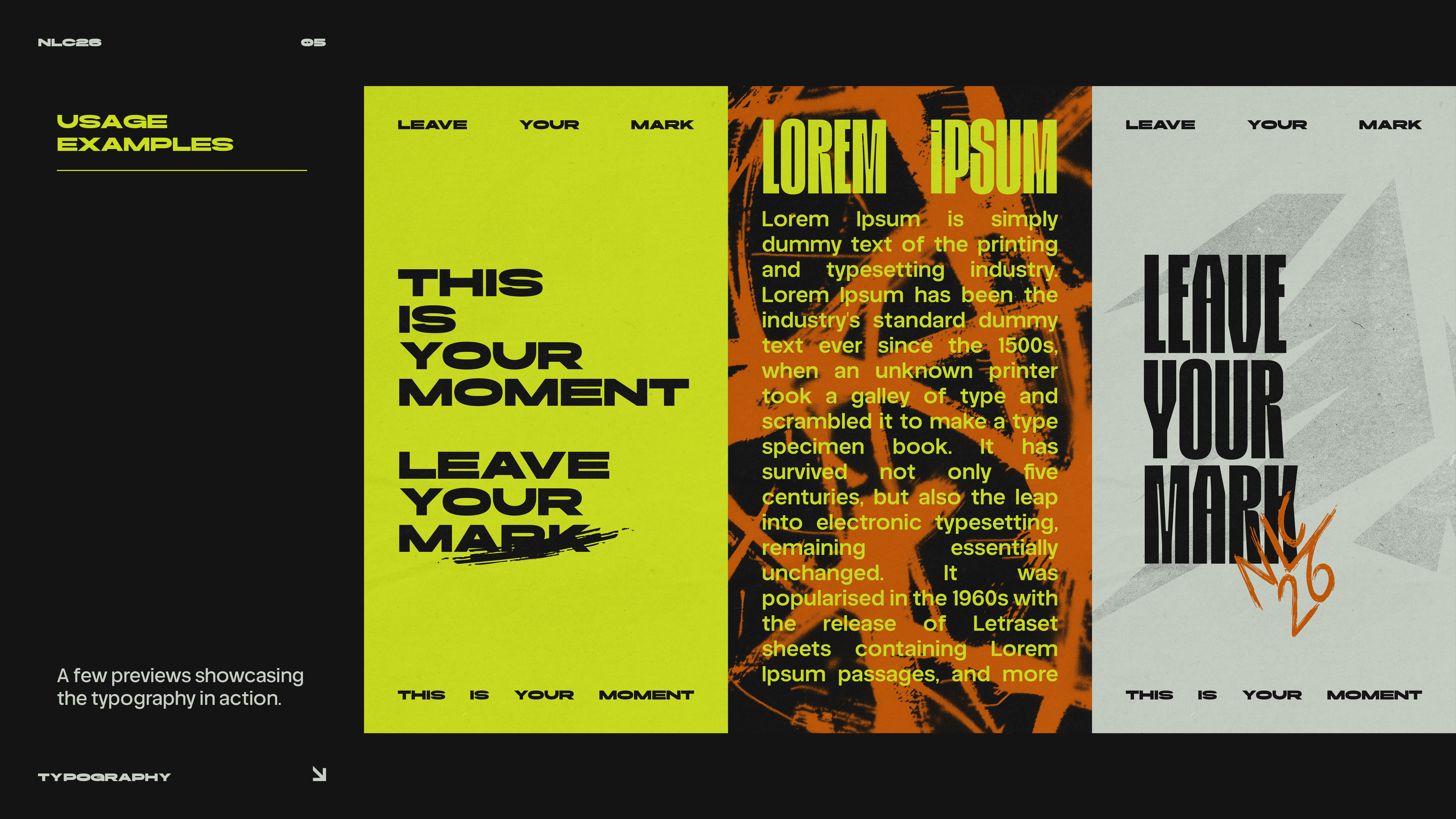
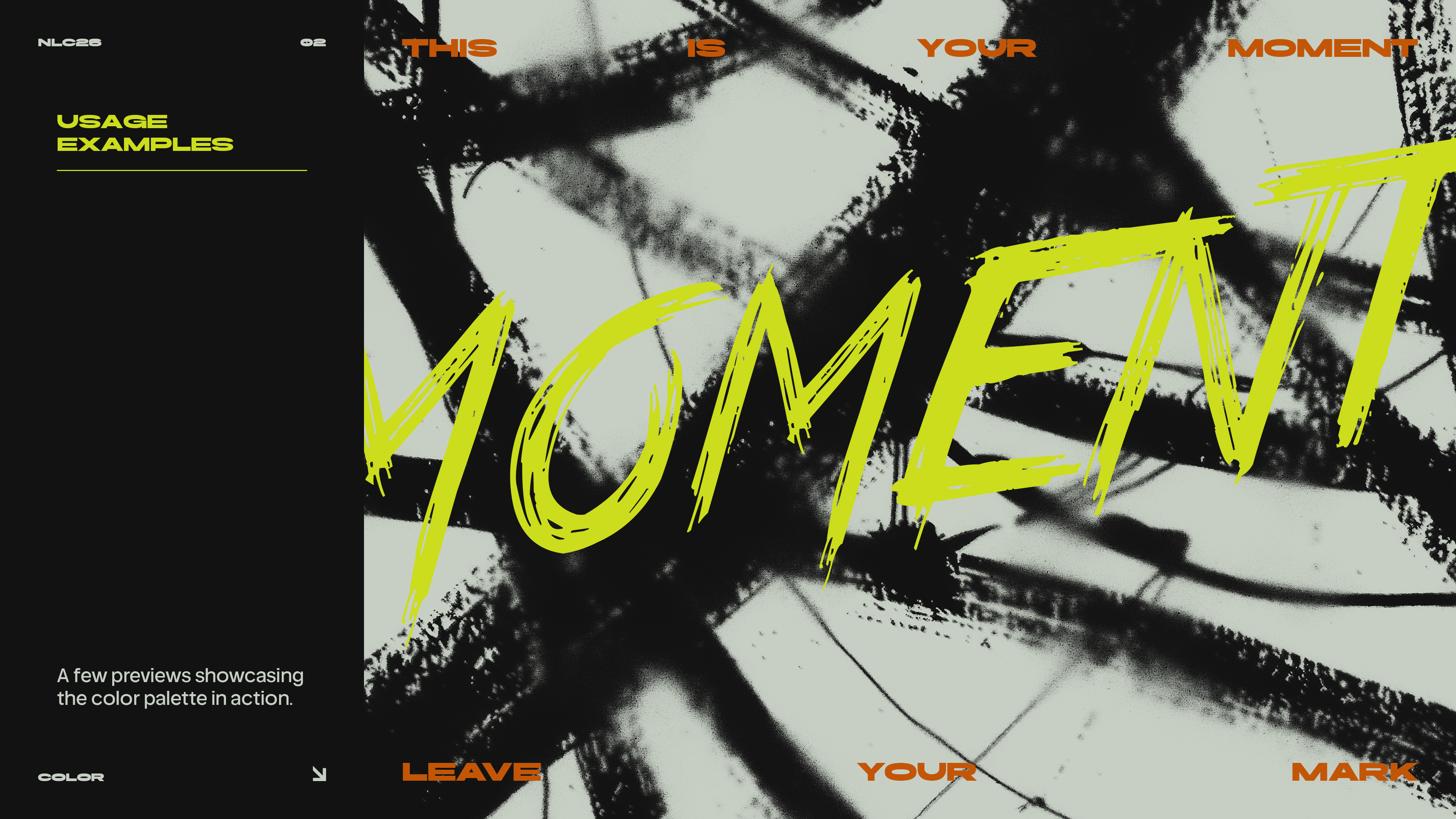
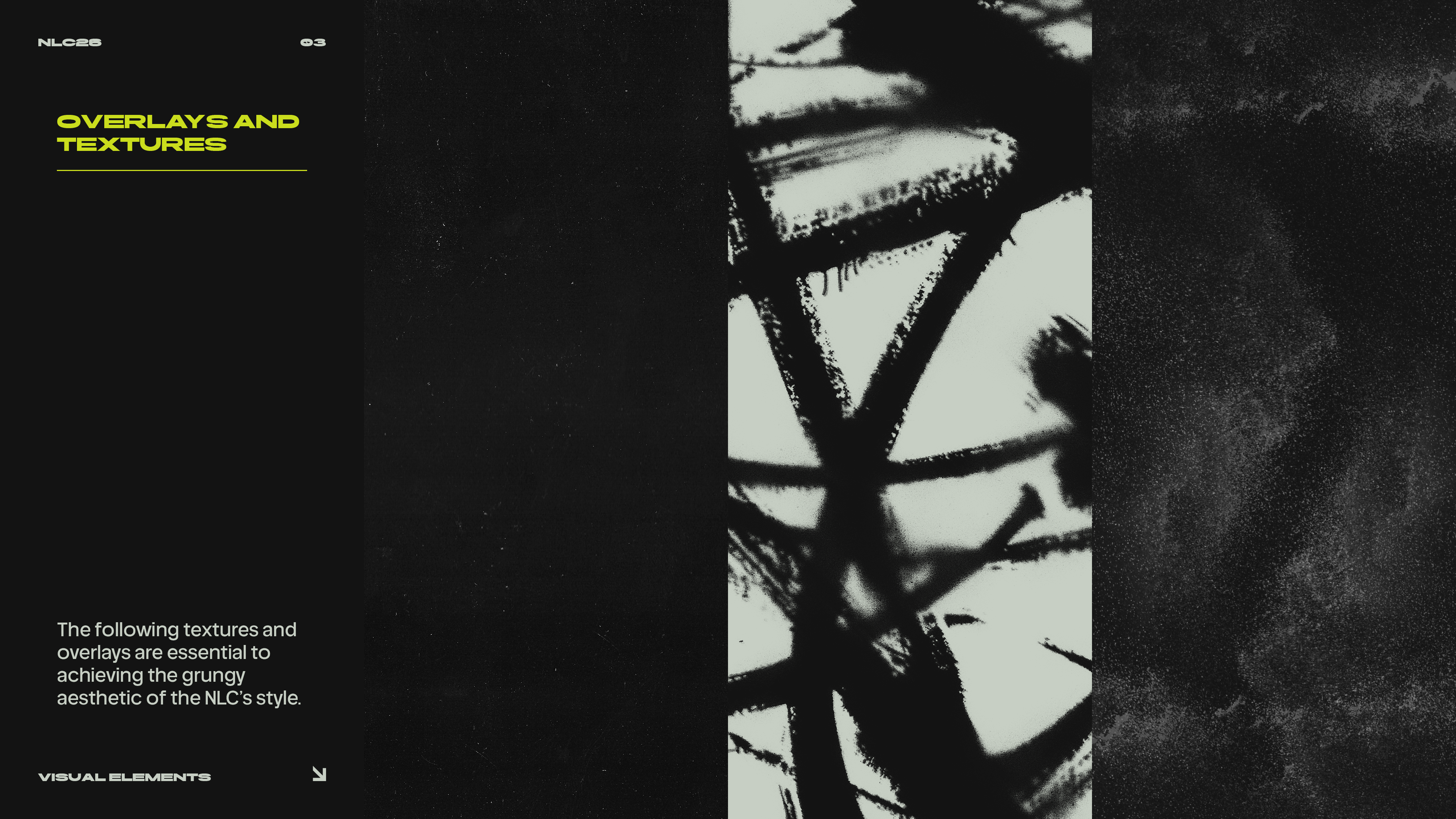
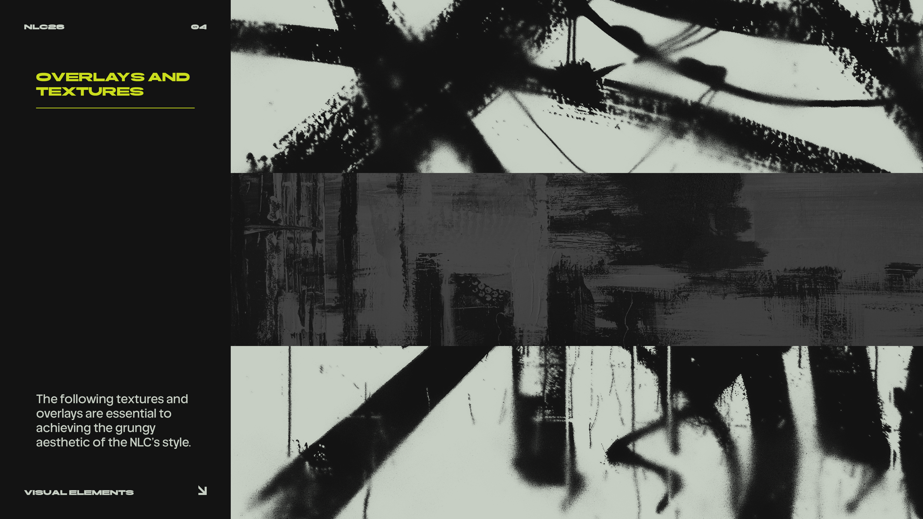
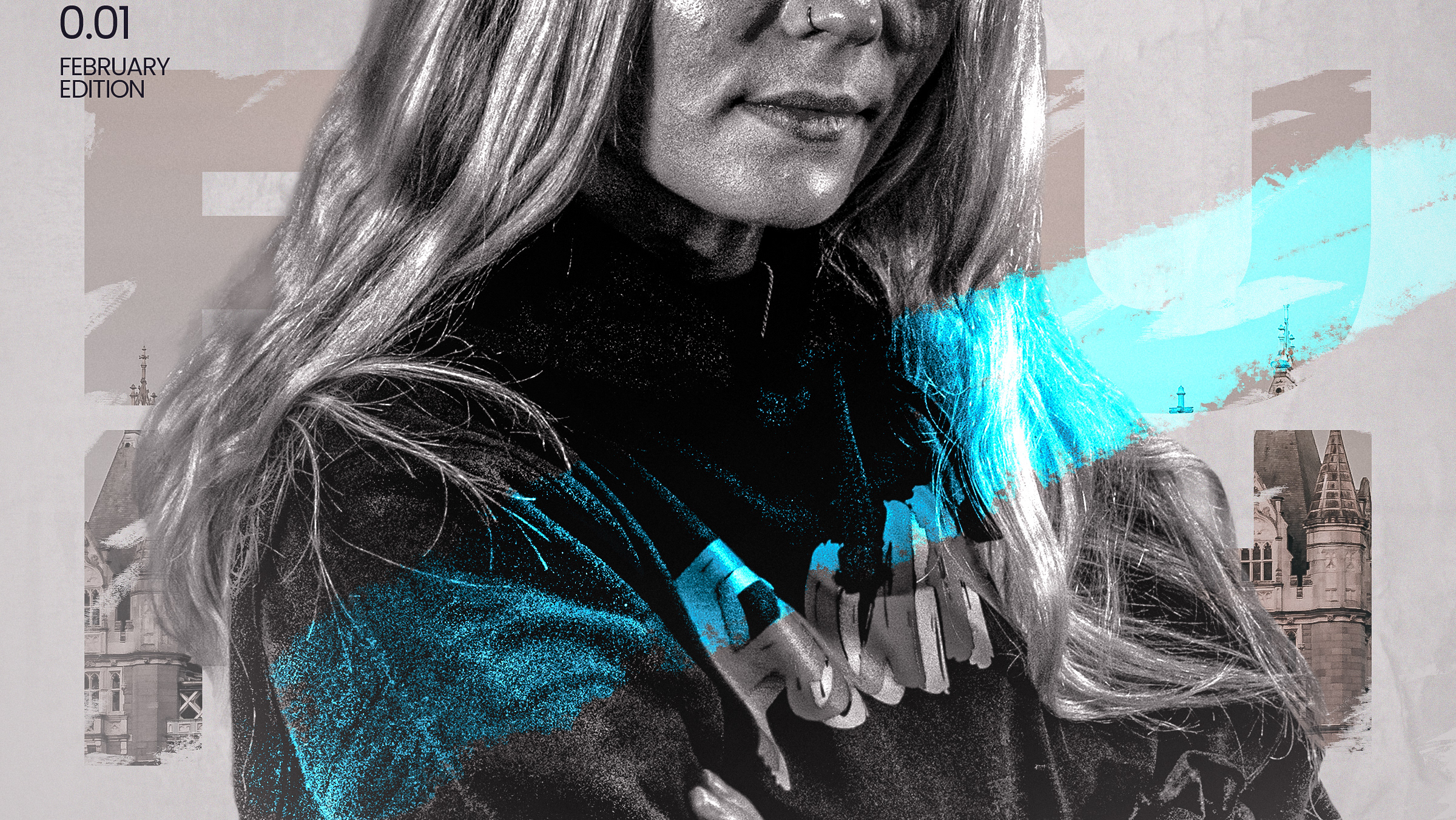
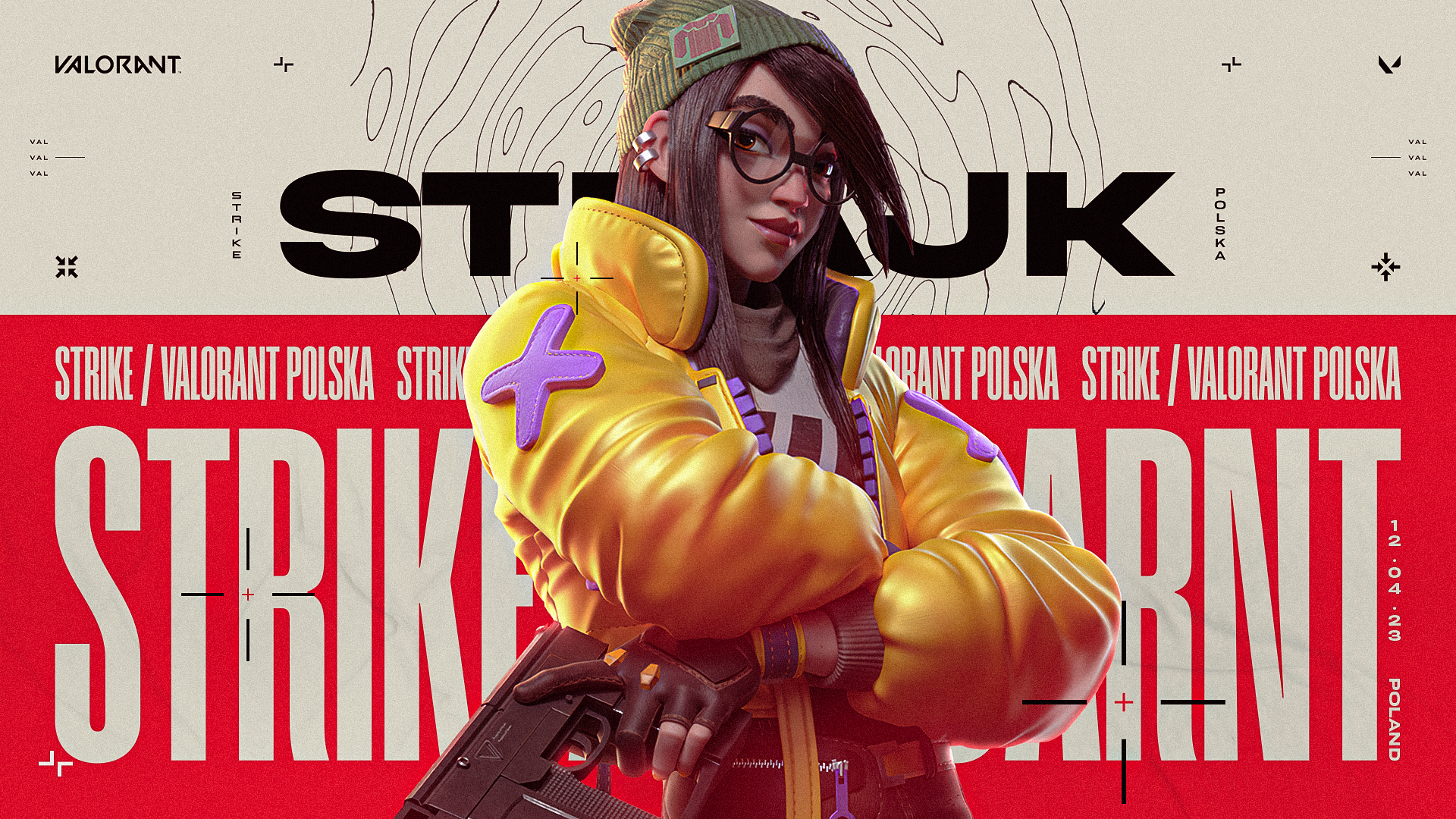
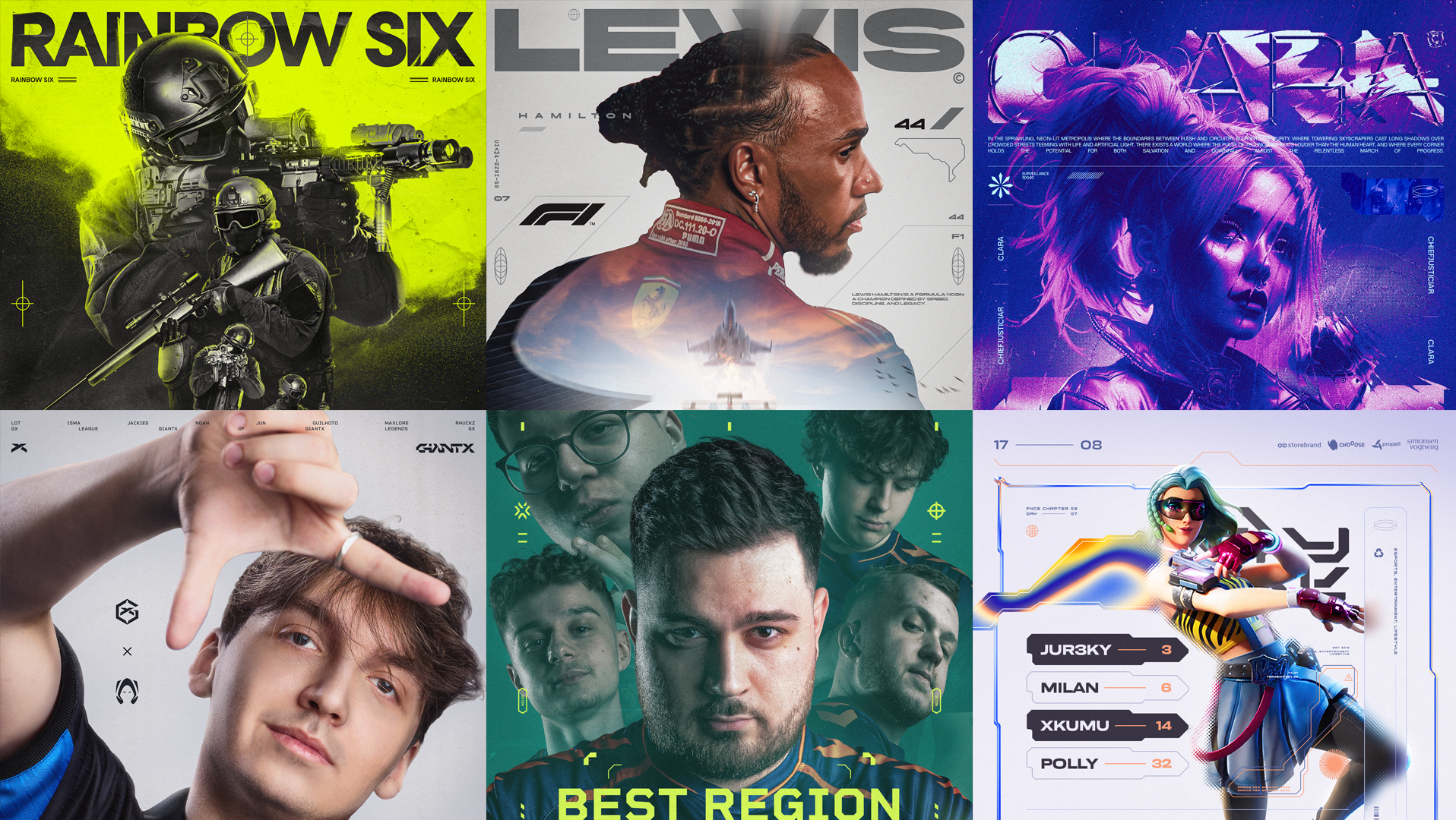
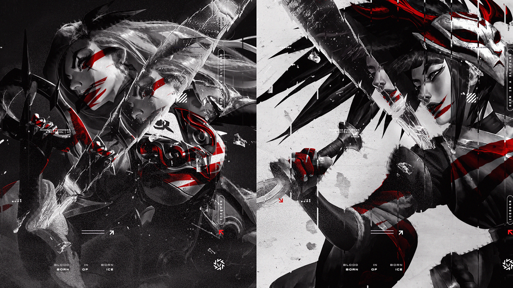
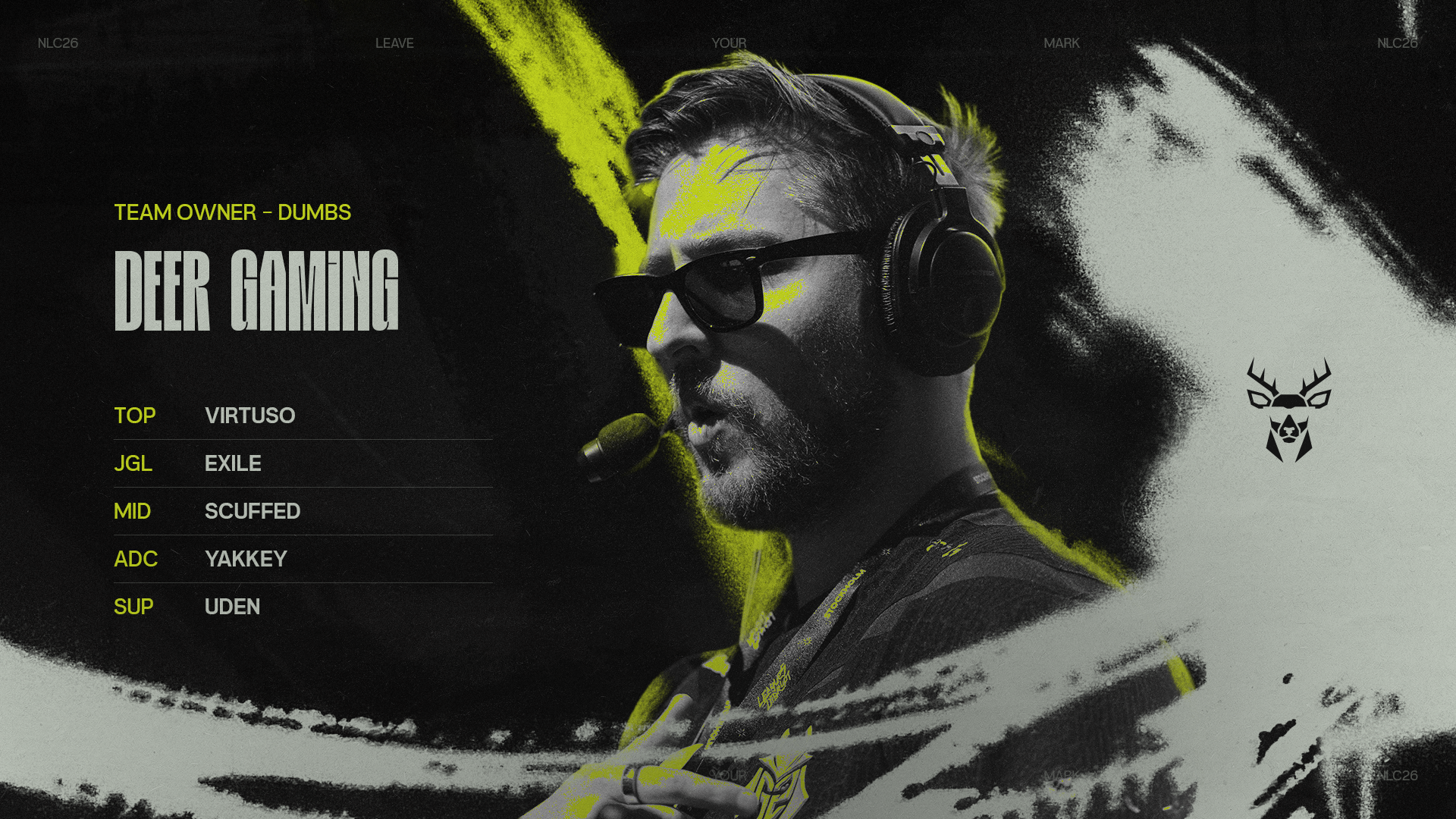
The visual style blends raw, graffiti-inspired textures with structured layouts, reflecting the league’s 2026 direction as a more streamer-driven yet highly competitive environment, expressive, energetic, and unmistakably bold.
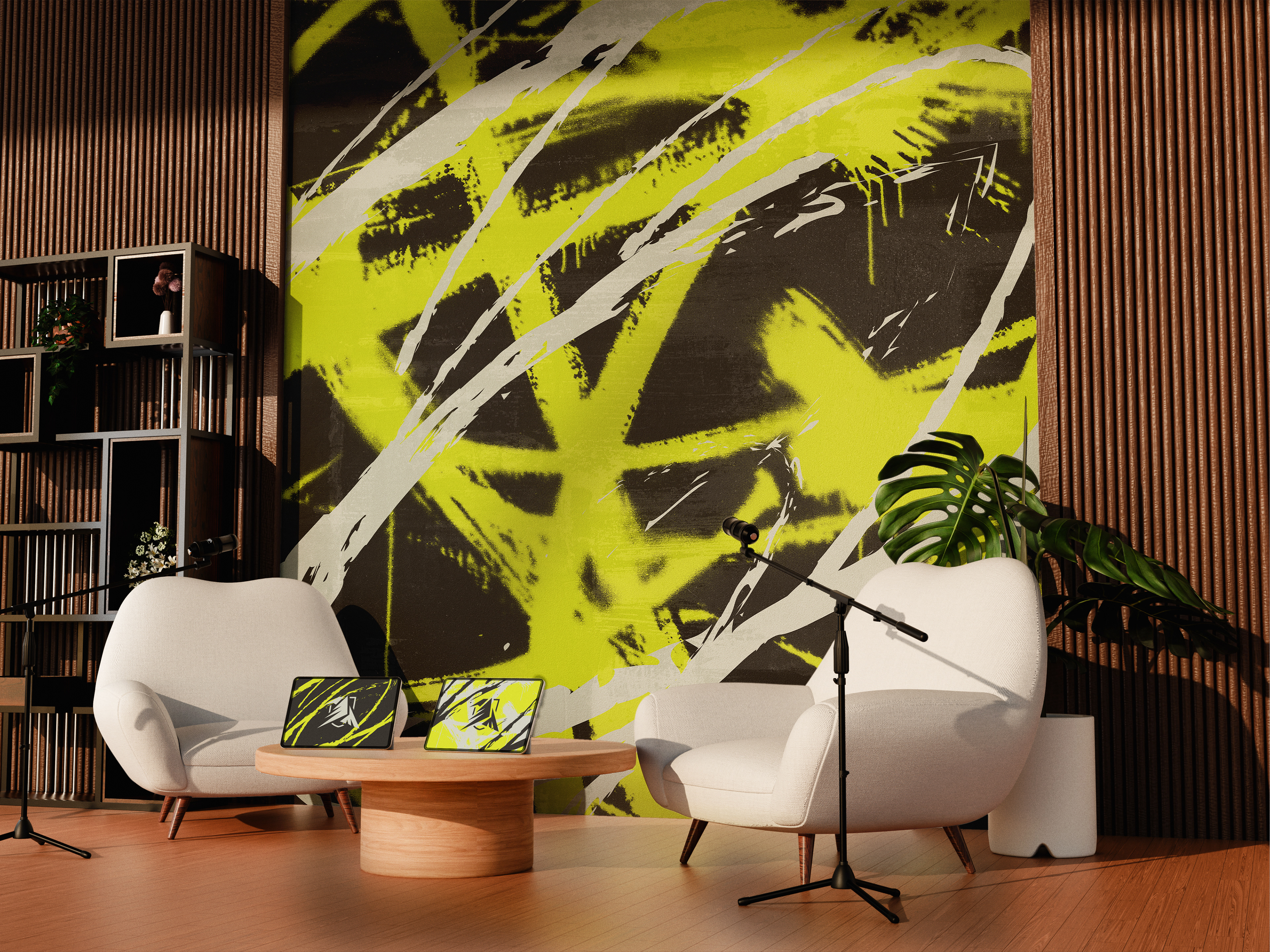
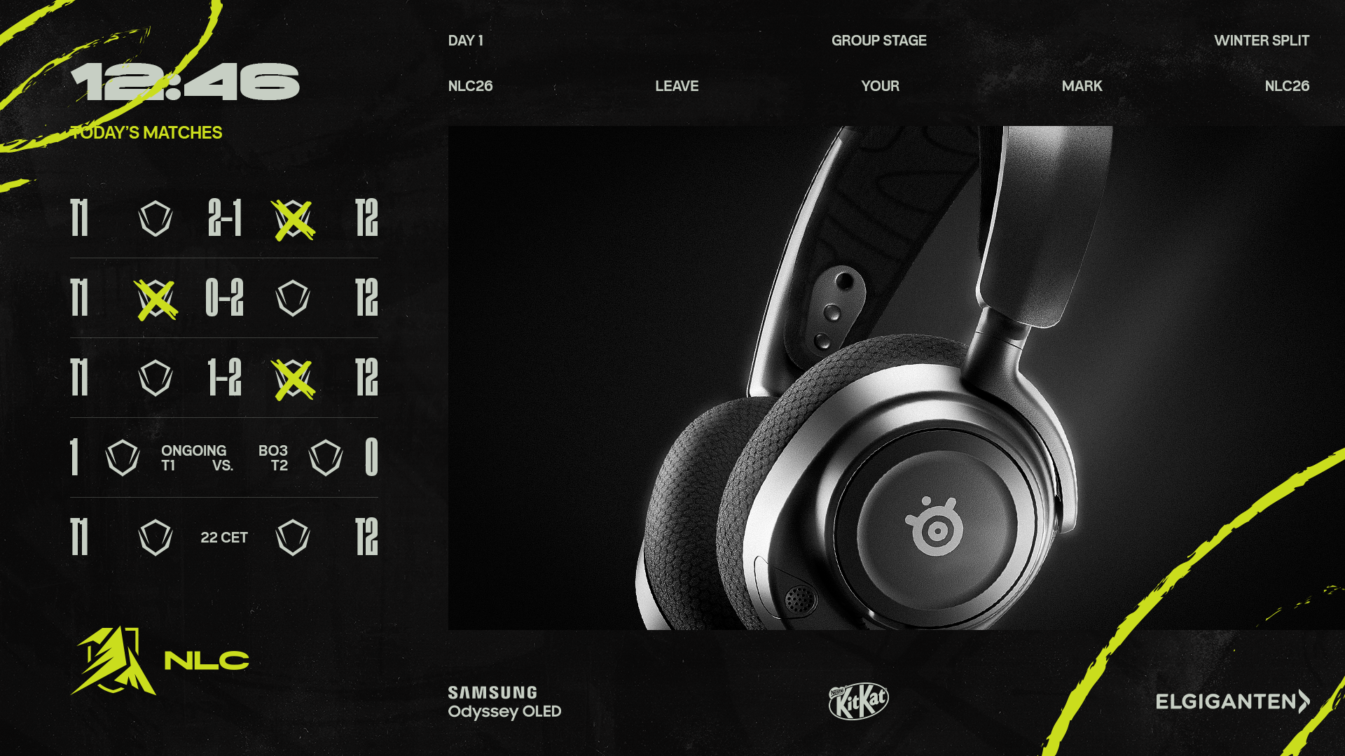
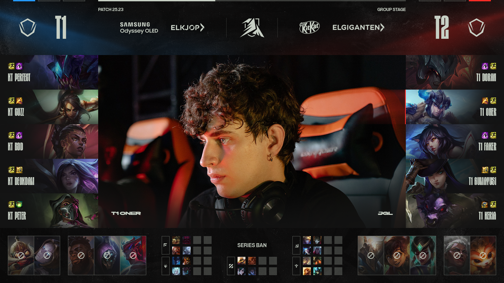
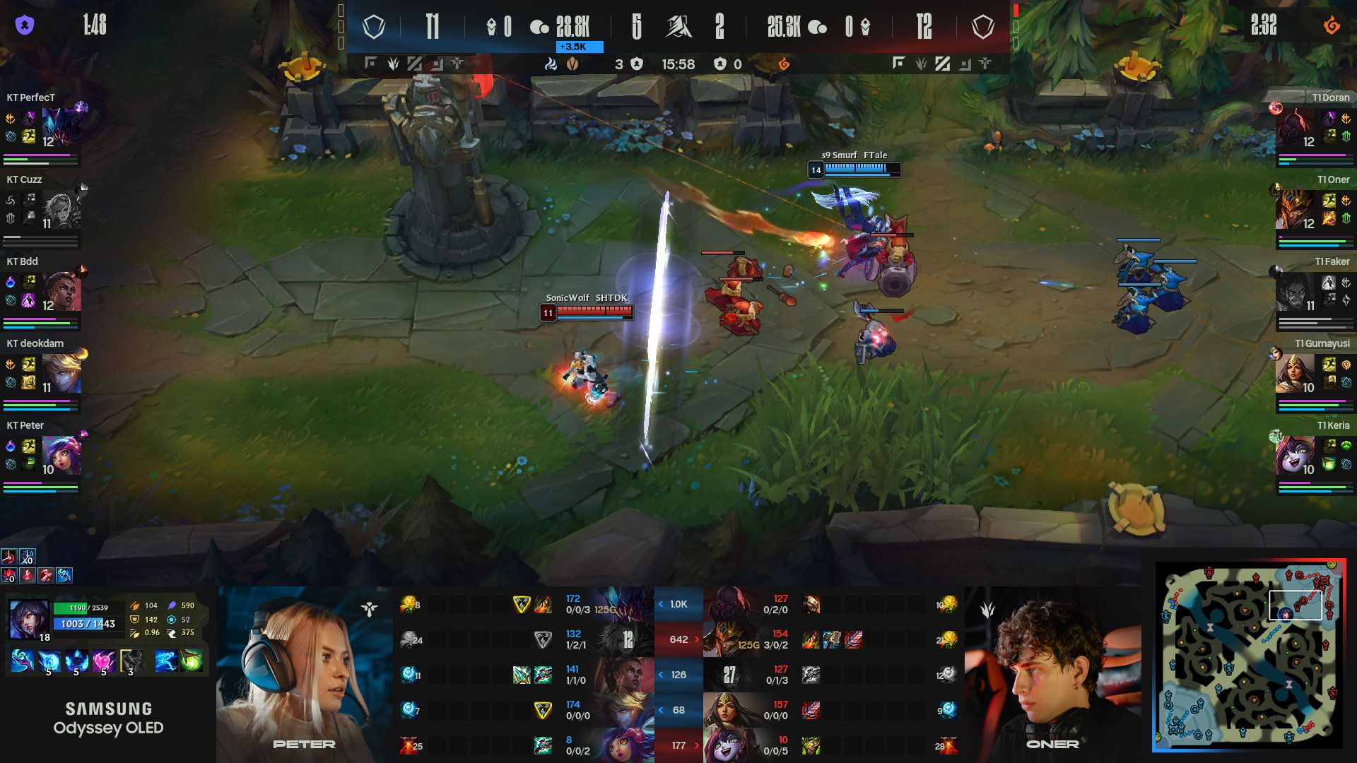
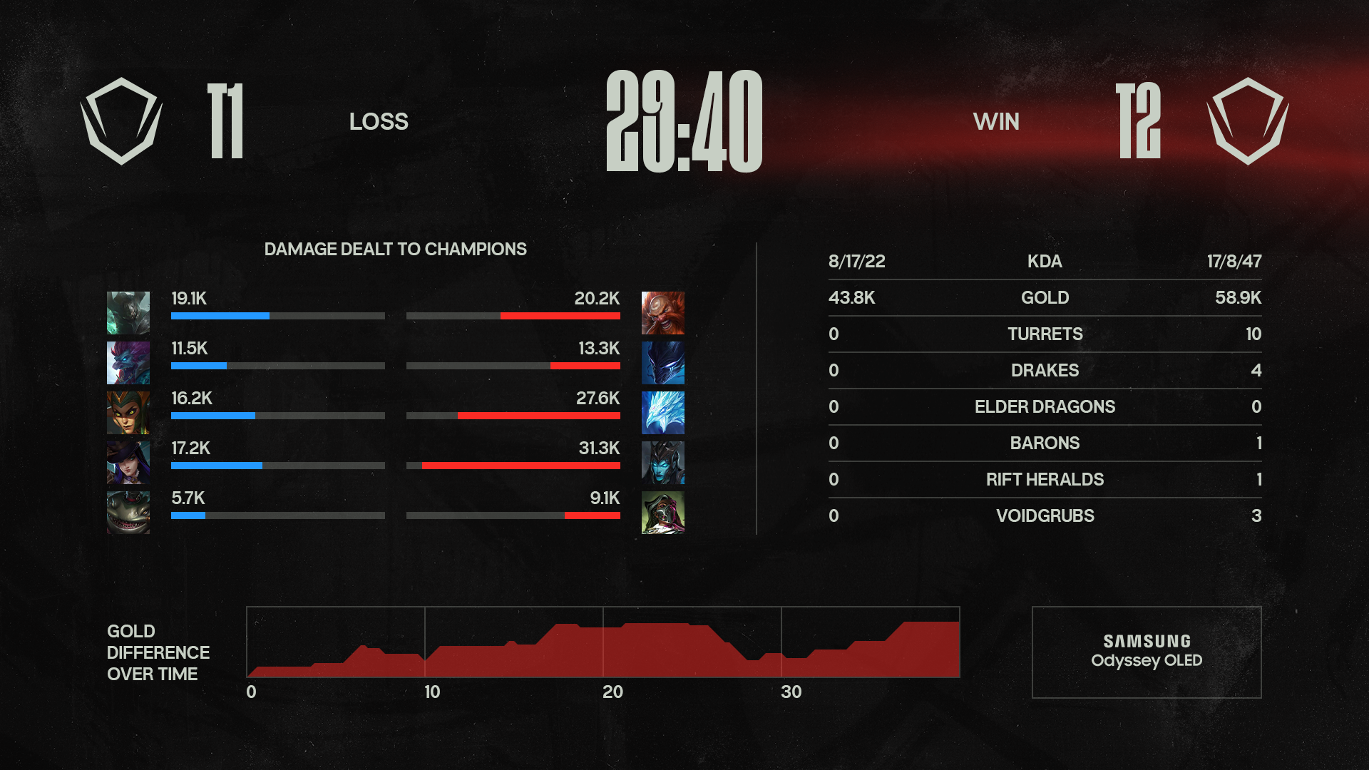
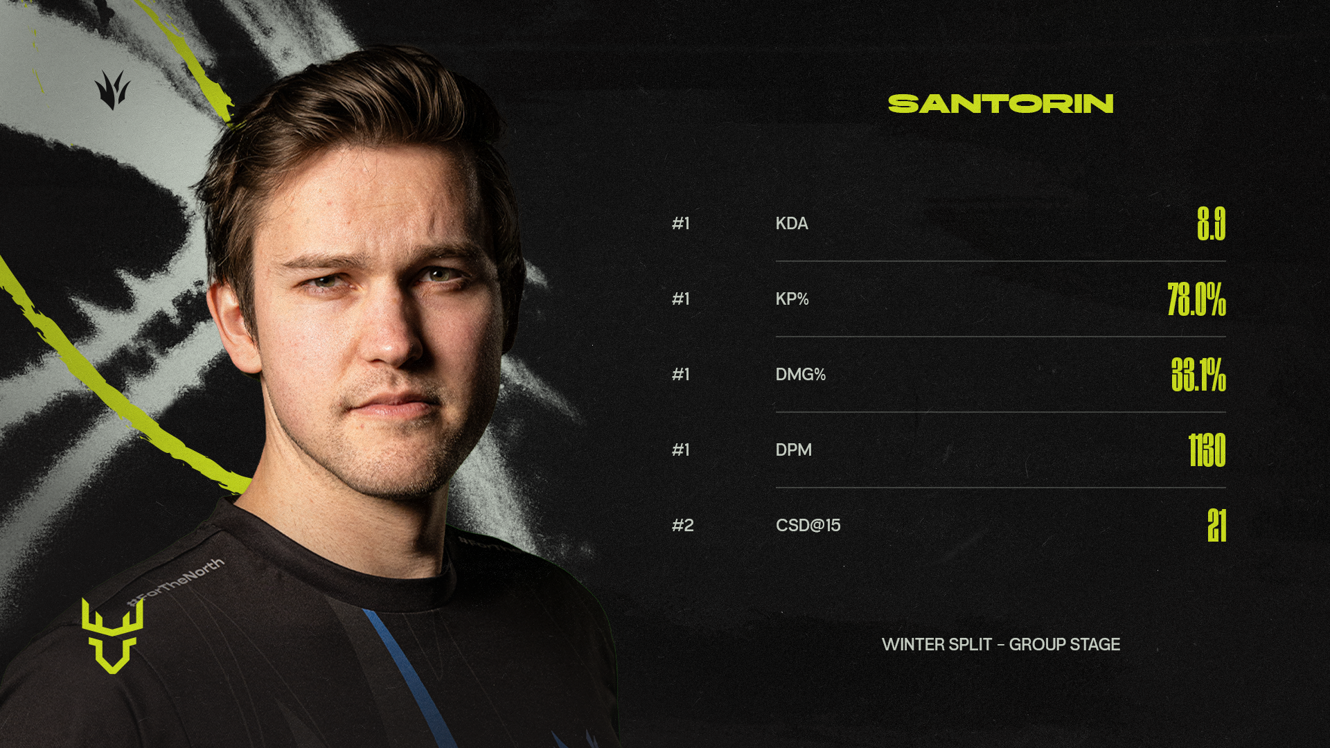
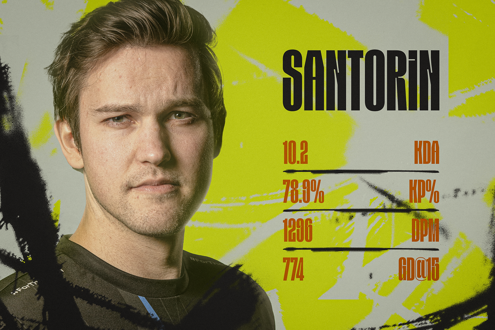
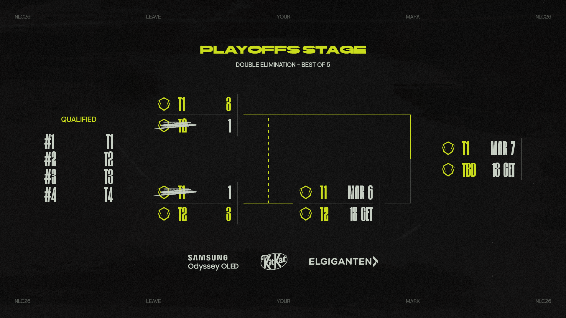
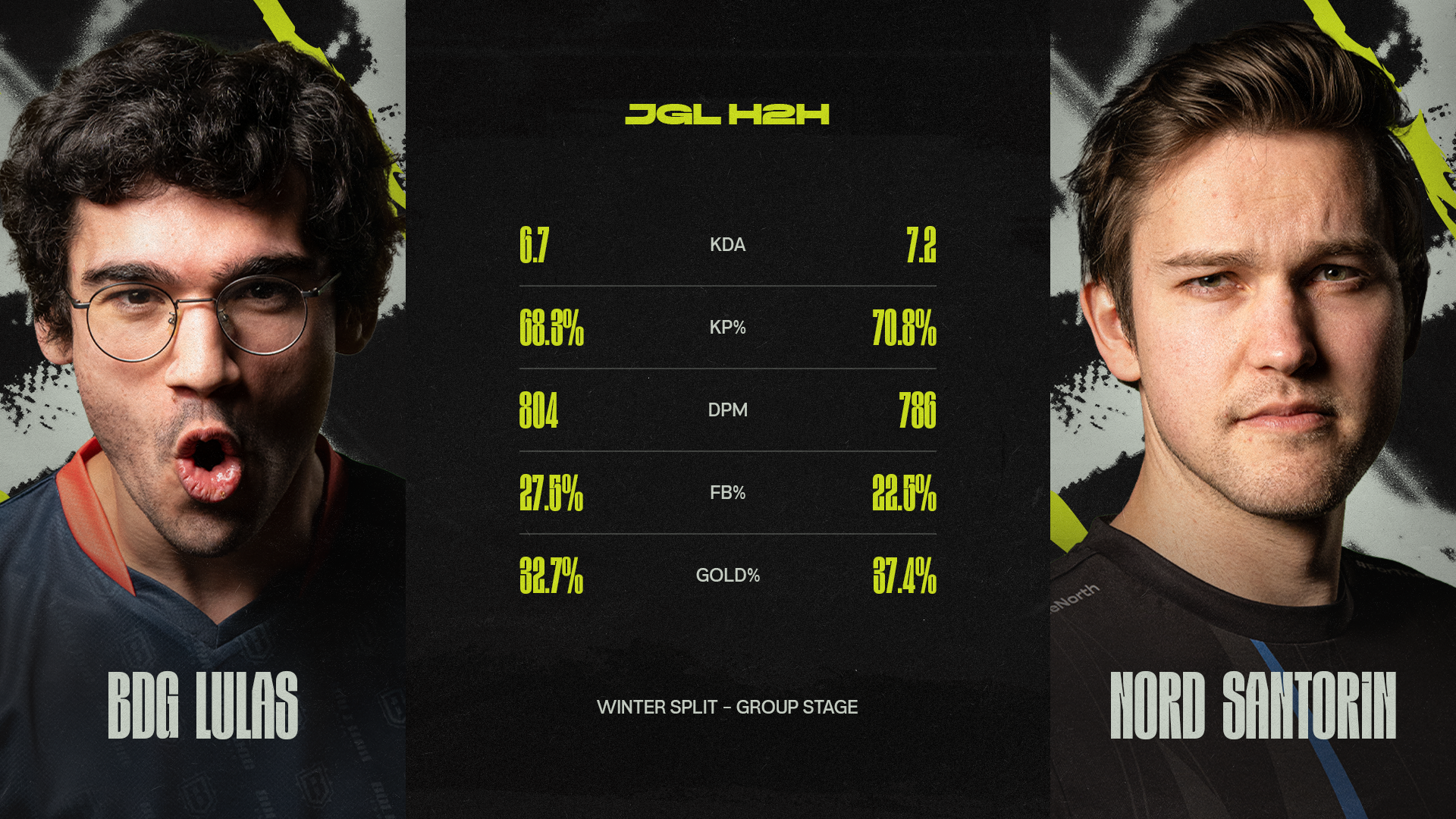
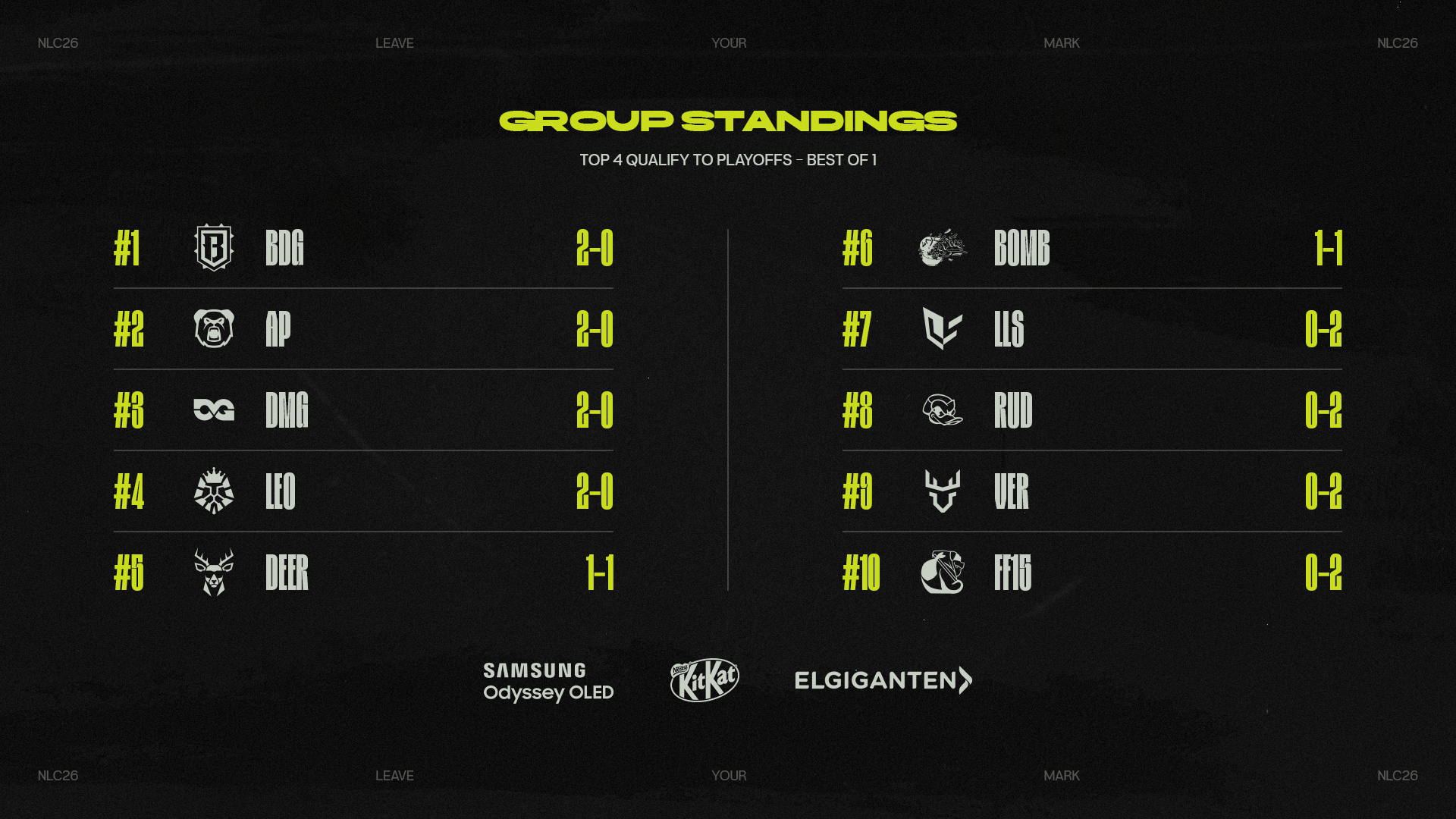
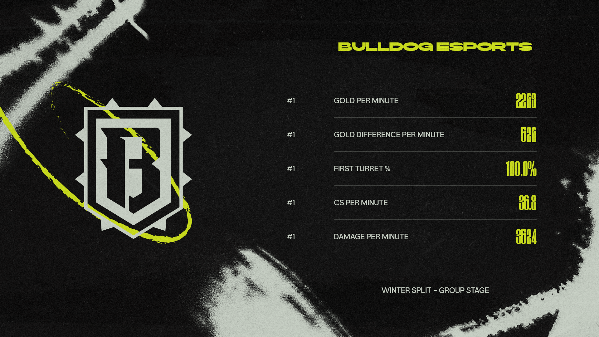

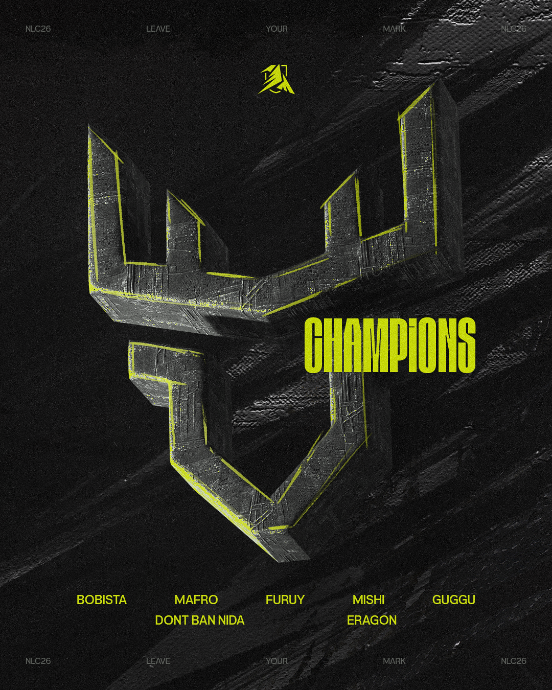
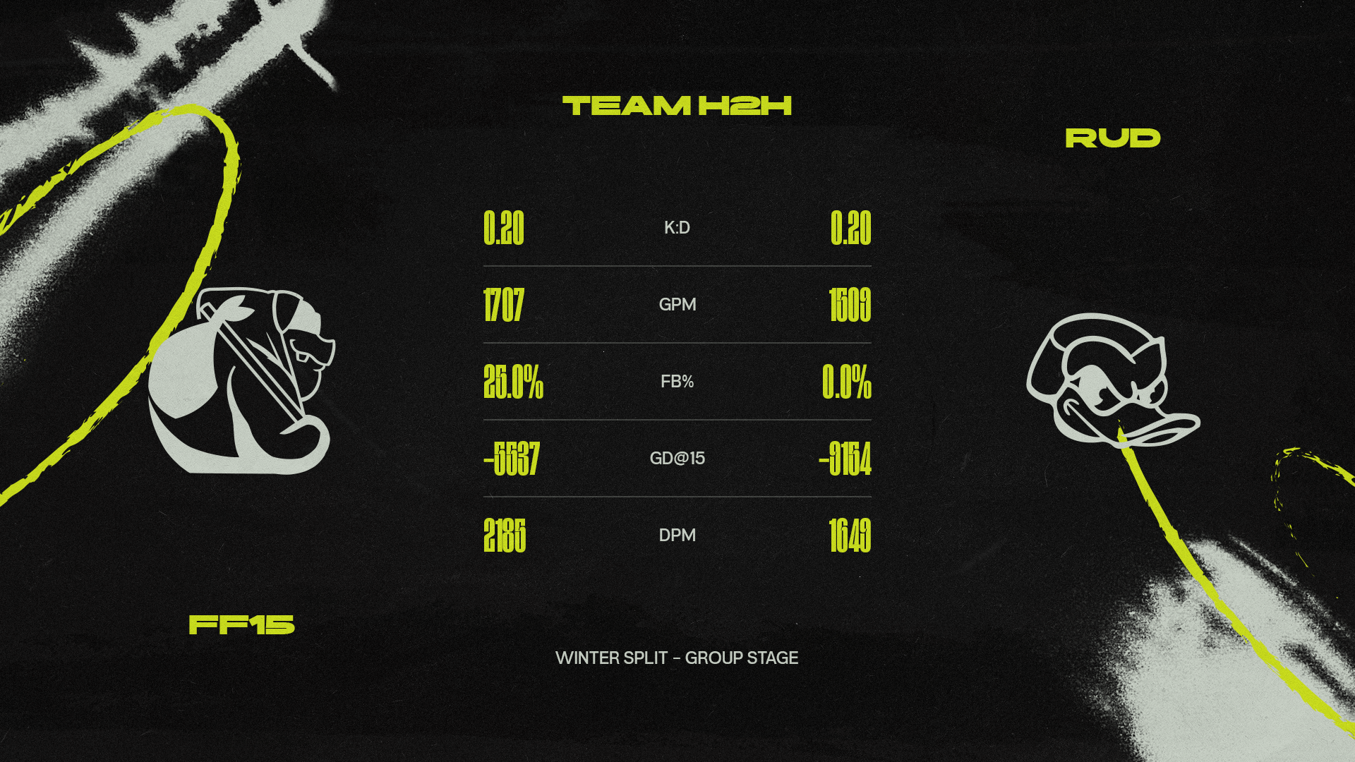
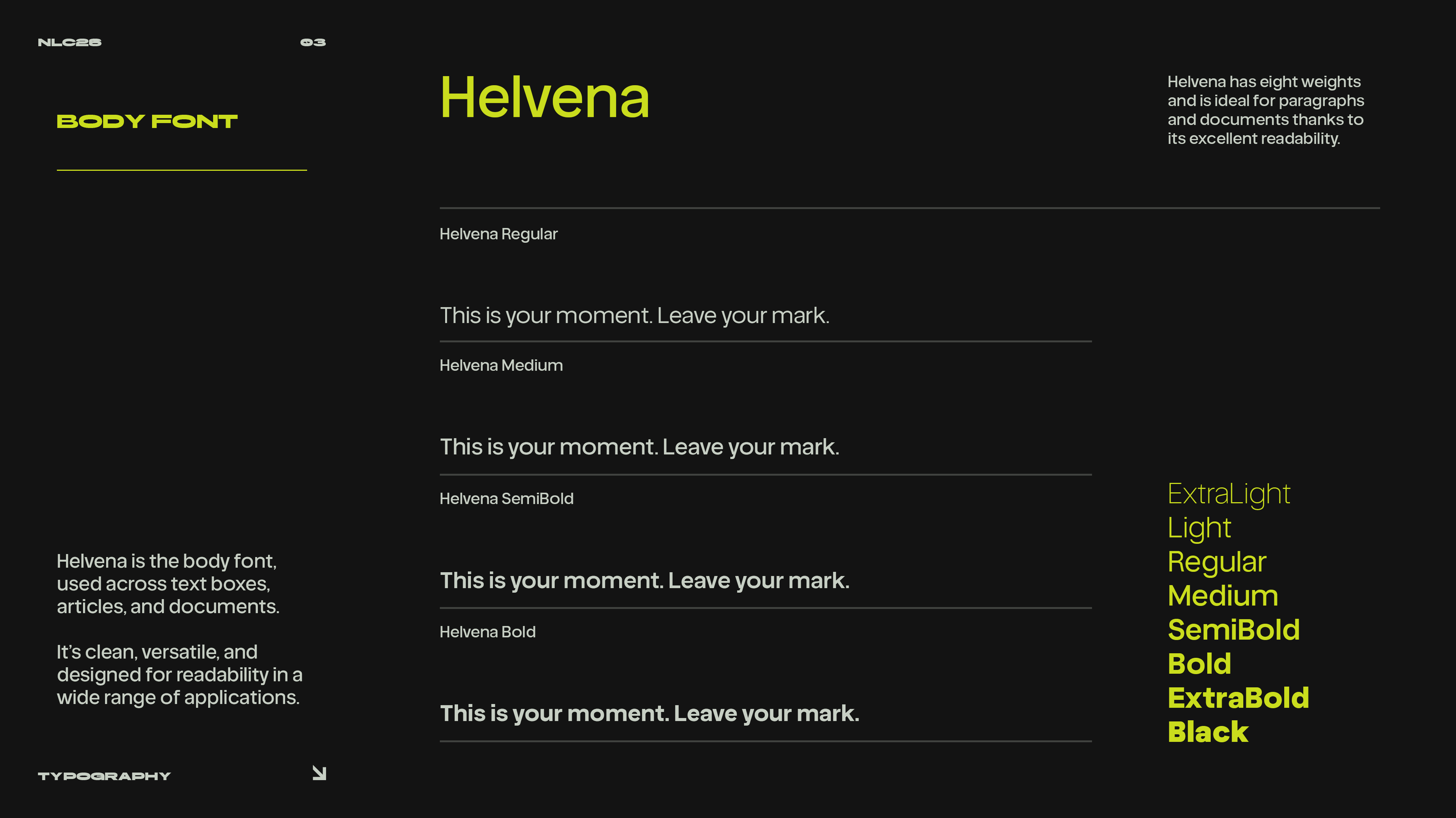
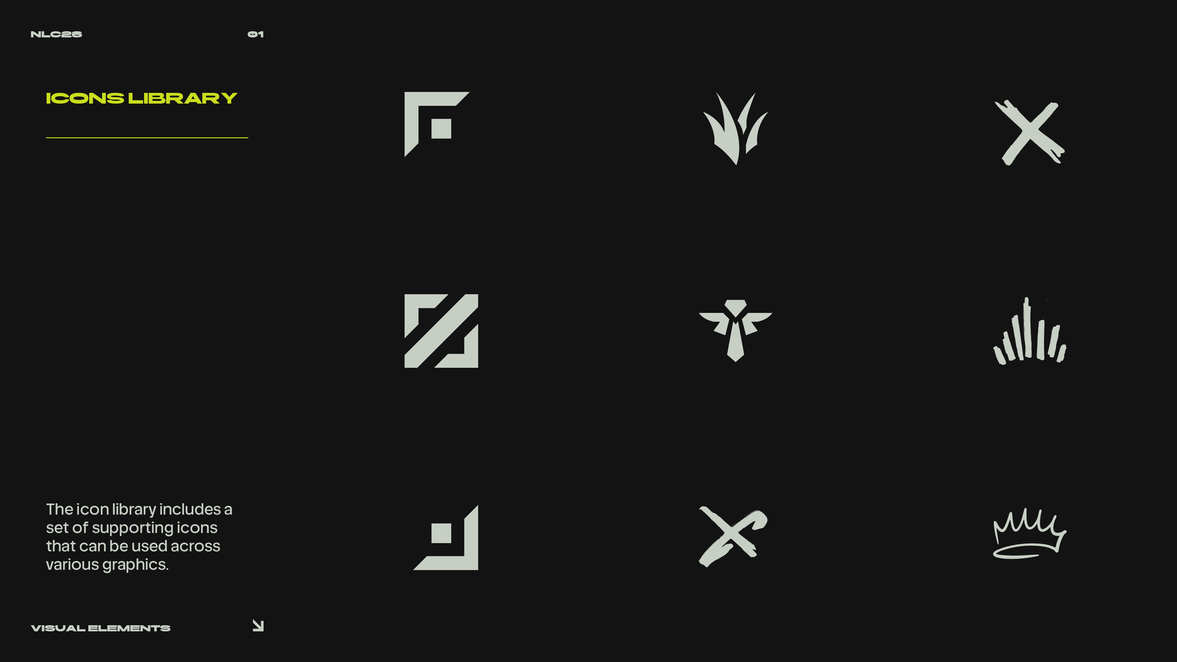
The visual foundation of NLC26, defining the rules, systems, and creative direction used across broadcast, social media, and league communications.